Profile
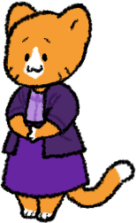
Design #1: Wait, she wasn't originally ours, that's right

The first Penny design wasn't even ours! Penny started life as the mascot to a little communal web host called Neocities, which like the name implies, was born out of the spirit of free, static web hosting as provided by Yahoo! Geocities. Penelope (the name I'll use to distinguish Neocities Penny from Pennyverse Penny) is the site's mascot, developed by the site's former designer, Victoria Wang (because "the internet belongs to cats" or something).
Amusingly, we've had people claim we "stole" Penny for Pennyverse despite the fact that:
- An orange cat is...less than distinctive in the first place (see: Scratch Cat)
- Penelope was never trademarked, thus Kyle and Victoria have no legal claim to her (if they even cared in the first place, which is doubtful)
- Penelope's image is public domain according to the Neocities press page
- Penny's design and personality was, as you'll see, largely our own creation anyway
Design #2: Caby's Penny

No one paid much mind to Penny before Caby started to draw her regularly. She was first used for other Neocities group projects, like the ill-fated Penny's Pages Neocities wiki, but truly found her home opposite Sebastian on Districts.
While Penelope didn't have too much of a personality other than being a cat, under Districts, she became a frenetic, erratic, easily-distracted sort, which played into her running off in Darkpenny. The idea was that Sebastian would often have to clean up and sort all the random sites Penny made recently, suiting a communal site directory.
An interesting, subtle design canary trap: while Penny was still just an ordinary orange cat by this point, Caby added a white tip to her tail that isn't in Victoria's comics featuring Penelope. If someone draws her with a white-tipped tail, they're actually technically drawing Caby's Penny, not Penelope.
Design #3: Clothes on, but still very very orange

With Kevin in the fray (some of his earliest drawings having been with Penny!), it was only natural that Caby would have to put clothes on her. She mostly got drawn in three kinds of outfits: skirts and shirts, some more formal than others (like to the right), intimidating t-shirts and pink shorts, or a lot of big jackets (after all, Darkpenny took place in the cold and rain).
Throughout much of her development, Penny was rather one-note and one-dimensional, essentially existing just to bug other characters. It took a while to get her to feel like she properly fit in with the more detailed, characterized stories we were writing at that point. Early on, we debated giving Penny a motherly streak, owing to her ending up temporarily with Colton, who'd just lost his own mother. It's still there to some extent in the interest in gardening (however grotesque those plants might be) that Penny develops near the start of the story.
Even still, she was unfortunately seeming more evil than anything else, and while fun, it didn't exactly make sense why Sebastian and Kevin hung onto her. More development was needed.
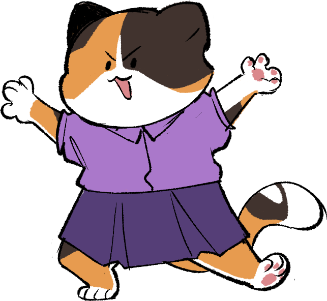
Design #4: Calico coloring

At the same time that Cammy was grappling with Penny's personality, Caby was unhappy with how flat and simple Penny's colors were. We wanted to, firstly, make her a little more interesting to look at, but also make her a little more unique and distance her from Penelope. We tried a few different kinds of markings on her, including, yes, a Garfield Penny, but in the end, calico worked best. Enough of her orange to still be recognizable, but also plenty of brown for contrast and flavor.
Funnily enough, the best solutions tend to be ones you've already tried, and with Penny, that was very much the case. In the end, we pulled back a bit on the demonic angle and made her and Sebastian a bit more like our own borb and Cammy, actually, in that they can equally bug each other for the humor value, but there is certainly care between them. After all, borb inspired Penny's "stinky" line from "Told Me So", the very first Pennyverse story, so it all seemed to work quite nicely.


Comments