whatever the heavens do not love, that thing needs love more
they/them • nominally an adult (21) • professional little guy & occasional artist. • oc sideblog @deathbounded • pfp by @stealingpotatoes

i figured i should probably make an Official Post™ saying that for the most part i’m not on tumblr (or, at least, not on this tumblr (or my oc sideblog), and i’m completely not on discord, at the moment (for Mental Illness™ reasons), and don’t plan on returning anytime in the near future. and given tumblr’s recent ai fuckery i’m even more discouraged to return.

i am only really on cohost these days, if you feel like finding me on other places. either way, i wish everyone well.

(mutuals, if you want to keep in contact, i may intermittently check this account’s dms, and i apologize for the incredibly delayed responses in advance)


artist tips
rileyav

don’t save as jpeg

suchirolle

as a former yearbook editor and designer, let me explain this further

if youre only planning on posting your art online, them please save it as .png ;this is also better for transparencies as well

BUT

please, if youre planning of printing your art, NEVER use png. it makes the quality of the image pretty shitty. use jpeg or pdf instead. and always set your work at 300dpi to get a better printing quality - this means, the images are crisper and sharper and theres no slight blurriness. i had a talk with my friend who is currently taking design, and pdf is much better to use when youre working with a bigger publishing company because it still has the layers intact, but if youre only planning on printing your stuff at staples or at some small publishing store, the jpeg is the way to go.

this has been a public service announcement

onecarefulowner

I’ve replied to this once before but I see it’s doing the rounds again.

This is all utter bullshit.

I’m sorry but if your qualification is working on the school yearbook, you have no qualifications. Do not pretend otherwise. As a former professional photo manipulator for advertising brochures, I can say that you’re not comparing apples to oranges here - if anything, you’re comparing fruit to farmyard machinery:

  • JPEG is a lossy format. It is suitable for web imagery because it sacrifices detail for reduced file sizes, but in doing so it introduces artifacts that weren’t in the original; if you load a JPEG for editing, then save it as a different JPEG, then you’re adding more artifacts formed from those first artifacts. Do this often enough and you end up with a horrid glitchy mess that looks like a puddle’s reflection after a stone’s been thrown in. You’ve seen those memes that have 3 or 4 different “found at” tags along the bottom, that look like fingerpainted copies of the original? That’s why.
  • PNG is a lossless format that comes in two primary flavours, PNG-8 and PNG-24, which use 8 and 24 bit colour respectively. 8-bit colour is what you have in GIFs, a limit of just 256 different colours in a predetermined palette, usually automatically chosen by your software when saving. These files will look the same as GIFs, potentially with large patches of solid colour instead of the usual gradual shading seen in 24-bit imagery. This is usually better for small banners or pixel art, as it can yield smaller filesizes than GIF format. (There is an animated version called MNG but it has very little web support, hence the continued use of GIFs.)
  • PNG-24 is great for larger images where detail is as important as colour depth, as well as printable RGB images and (if supported by the client) full colour images with gradient transparencies. It most certainly does not make “the quality of the image pretty shitty,” as it preserves every nuance. File sizes can be smaller than JPEG for small images, or significantly larger for large images.
  • PDF is a container file, whatever you put into it will be pretty much preserved as it was, so you gain nothing but lose nothing.
  • TIFF is what you need to be using for archival or print-quality imagery. It has support for multiple layers, multiple colour channels (RGB as well as CMYK, which is essential for accurate print rendering), and everything is preserved exactly as it was seen on-screen when being composed. There are compressed versions available, they use similar methods to PNG in order to maintain detail without sacrifice; next to whatever your graphics program uses natively, this is the most interchangeable format available for professional use.
  • DPI is important only when used in combination with image dimensions; in and of itself it serves no purpose. If you make a brilliantly detailed 640x480 image & set it to 300dpi, you’ll receive a brilliantly detailed 2 inch x 1.6 inch print. This is great if you want to make a postage stamp, but not if you’re creating an A4 flyer! Determine the image’s dimension then set the DPI accordingly; 72dpi isn’t hideous especially for text-heavy work (it’s ~3 pixels per millimeter), and 150dpi can be suitable for many images. Unless you’re interested in photo realism, 300dpi is usually overkill - for our hypothetical A4 flyer, you’d need a file of 2490x3510 pixels for edge to edge printing, with a correspondingly high memory requirement and filesize even if using a compressed format.
  • Keeping the layers intact is utterly unimportant for print work unless you want to use a separated colour print method that requires multiple passes to lay down each ink. If you send a file with all the layers, masks, etc. off for printing you’re liable to get it sent back unactioned, as they won’t want to take responsibility for choosing the wrong elements for printing. Save your work with everything intact, then save a flattened copy especially for printing purposes - this is one of the reasons Save Copy As… is a common option in graphics manipulation software.

This has been a Public Service Rebuttal.

queensimia

FUCKING THANK YOU

As a designer who’s worked a few years for a newspaper, I cannot begin to tell you how much OP’s post (edit: response, technically) made me cringe. I would have killed to get a photo as a TIFF for once instead of having to tear apart PDFs only to find a 50x100px 72dpi shitty JPEG inside for the 5 millionth time…

JPEG and PNG are best suited for web formats (and it is perfectly fine to save your web version as JPEG, that’s what it’s goddamn for). You will make a designer cry if you send a web-safe JPEG for print, however. And if you have a vectorized logo saved as EPS (or even better, AI), you will make that designer’s year.


apleye

image

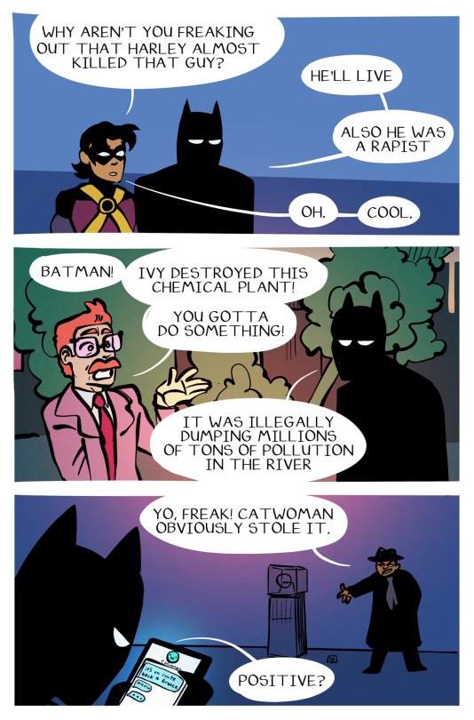
Continuation of my sirens post, and a friendly reminder that batman isn’t on the side of the law, he’s on the side of justice


yueesaw

アンダーカバー ⚖️

image

bribloo

image
image
image
image
image

some redraws of minigram panels for fun :p
(i didnt finish kazui)


sepezzz

image

also never posted this photo study from like 2021 i think?


ds2mtoi

image

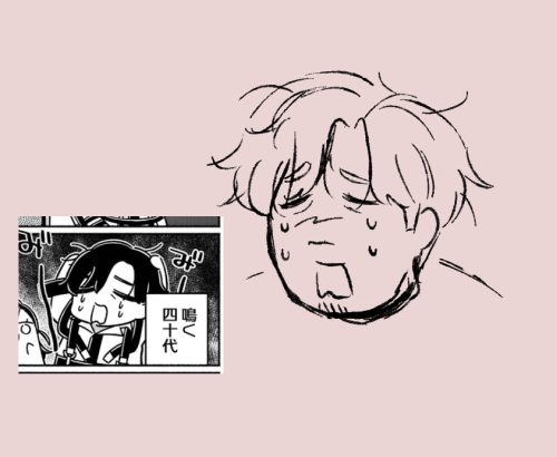
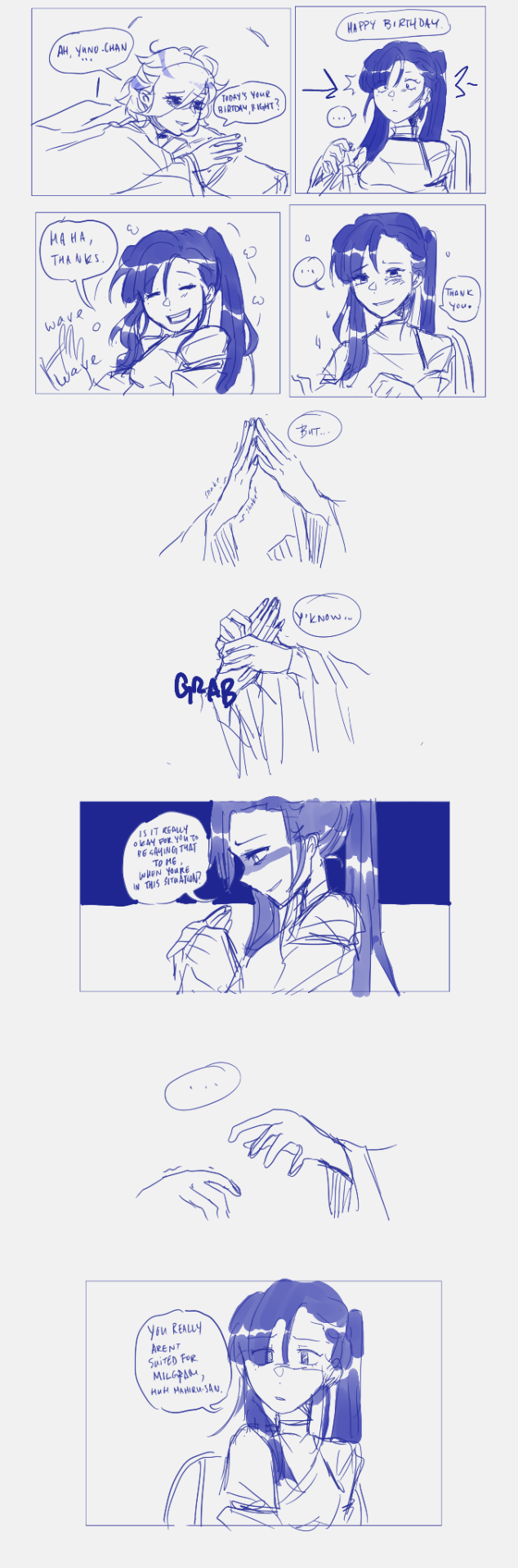
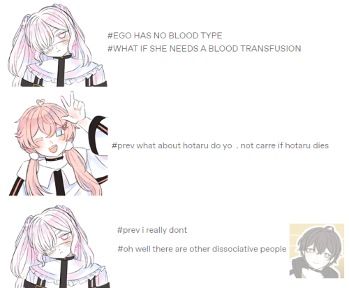
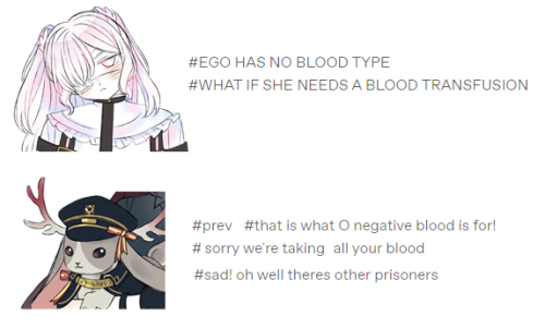
『milgram』 009, john.

i guess it's my job to keep things on a keen level. me, the other you. i'll take it all on.

scroll to top
A.