
SO! You've seen these little things I do sometimes and you want to know the process!
It's genuinely super simple, so here goes! Apologies by the way if anything is unclear or glossed over. A lot of this is personal taste and such so I hope this can be a nice boost to create something!
RESOURCES AND THINGS TO KNOW!
To preface this little guide already assumes you have basic knowledge of color distribution, lineless art, or breaking up art into proper layers for later processing! I am also assuming that your art program has access to scatter brushes and tiling textures. Personally I use Clip Studio Paint, but this can work on other apps. Anyways, here are some good sites for this:
- EZGIF - Free, easy gif maker for assembling any kind of gif*! It also has stuff like converting those damn WEBP's back into png.
- *PLEASE KNOW THAT YOU CANNOT MAKE GIFS THAT ARE PARTIALLY TRANSPARENT. YOU MUST USE A SOLID COLOR UNDER ANY PART THAT IS OVER BARE CANVAS
- Transparent Textures - Free to use source for HQ transparent textures that tile! Amazing for finding a paper texture for these if you commit to the paper doll look. Best results for textures that are in white or black!
So! You have a finished, prepared piece that you want to glitterfy. Well I'm not covering that right now so you can scroll down to That part if you came just for the glitter. This next section is for...
PREPARING THE PAPER DOLL
To start, your piece should already be separated into respective layers in any order you'd like! We're about to use a ton of clipping masks so Make sure you know your program before starting! So, as my example we have my oc Roy, resized to around... 1500x1500 or the nearest equivalent Smaller is better because it brings out the texture! He looks a little ah...Flat, though right now?
I'm using this guy for a couple different reasons! Those being:
- Roy has translucent bodyparts! Just so you will know what to do with characters who are translucent! I'll get to this in a moment so sit tight
- He has a clear, defined, and distinct palette that is easy to pick a color to slap the glitter on! This is important because I personally find balance to be the most appealing part of the finished art.
- He also just has a lot of doohickeys on his design.
This is where you need your transparent texture! You can use any kind of texture and I encourage experimentation and such, but I personally use a simple paper texture. What we are going to do is go through and clip our imported and tiled texture to each applicable layer! (Make sure to just Copy and Paste the layer you do NOT need to repeatedly go through this menu...)
And... When you are done, you should have something like this:
"But why don't I just clip the texture to the entire piece through a folder? Why go through the hassle of clipping to each individual layer?"
Well that's because of the next step, where we will be adding the shadows. If we don't clip each individual layer, your shadows will look like this example on the left which sort of just ruins the 3D effect and kinda just looks icky, as opposed to this, which is nicer and smoother.
Now I'm no lighting wiz! In fact I'm rather mediocre at best but some general tips for adding the shadows:
- Try to keep your shadows going all in one direction mostly! It gives the effect of one light source and generally just looks better than if you shaded around ALL edges everywhere.
- Try to only shade where there are parts overlapping that need the dimension! Overdoing it can make the piece look odd. It's especially helpful to separate any details like different shades of hair, layers of hair, etc so that you can put as much volume as you want.
Once the shadows are all added in you should have something that looks like this:
Which looks good! Now I'd sometimes stop here if I can't pinpoint how I'd like the glitter to sit or if I think the piece just doesn't need it, but we're moving on to the big important steps!
ADDING GLITTER
This part is entirely up to your taste! But I'll describe how I do my glitter stuff. Firstly I start out by identifying which color I want to pop out. For Roy here I chose the red parts! For your character it may be different. Experimentation is key!
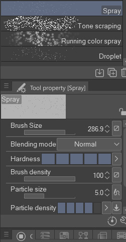
This is also, however where you need that scatter brush I mentioned earlier. Personally I just use the default CSP spray brush, but again go wild!
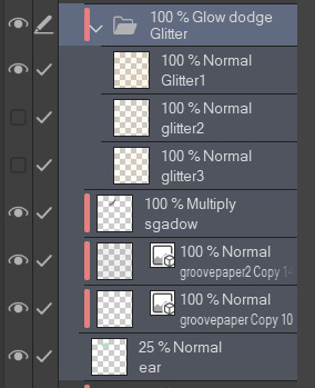
Make a folder above your piece, set its blending mode to glow dodge (or add, or add glow depending on what options you have), and create three layers inside of this folder. Setting the folder to clip is optional right now but will be needed later.

Then, fill each glitter layer with your choice of particle in whatever color looks good! Yes, you can do gradients and other stuff on the particles too! World's your oyster.
^ Unclipped example of a glitter layer.
Glitter tips for the early 2000's webcore enthusiast:
- Use different strokes and patterns for the glitter distribution! This helps it animate better by moving around. For example this time I went diagonally for the first, horizontally for the second, and then in loose circles for the third. Particle density and stuff is also completely up to you.
- Use a color that would pop against the intended area! For Roy I used an orange-ish yellow since it compliments both blue and red.
So now we have the layers! This is where clipping is our best friend once again! You're just going to go in and clip the glitter to whatever layers you want it on. Entire folder, not just one of the layers!
Once that's all done, go through and toggle the respective glitter layer for the frame, saving individual copies when done. You should end up with 3 identical images with different glitter distribution.
"BUT WAIT! JONES, THE TRANSLUCENCY!!" I hear you call! Yes, this is where we handle that! If your character is NOT translucent, you can scroll past this section.
Open up your frames all in one canvas, stacked on top of eachother (no jittering or slight displacement! ON TOP of eachother!)
Our layout should look something like this...Note how the translucent parts are rather hard to see, well if you took your frames and put them in EZgif, they'd be gone entirely! That's because you physically cannot have a partially translucent gif due to technology limitations. So an easy little cleanup thing I did was:
1. SELECT THE CANVAS AROUND THE CHARACTER WITH THE MAGIC WAND TOOL. Do not have any expansion settings on or it probably won't look right in the end.
Make sure you do not miss any gaps! I personally missed the gap between the arm, leg, and lanyard and I had to redo this next step...
2. SELECT -> INVERT SELECTION
3. FILL SELECTION WITH THE DESIRED COLOR. IT MUST BE OPAQUE. I personally picked this cloudy gray color.
You can now save individual frames of your character with the fill so that they don't go bald when you move on to the next step! Again, you should have 3 frames.
FINISHING UP
This is nice and easy. Upload your three frames into EZGIF and wait for it to process. It'll look like this if you're in the right place.
Once things have loaded, make sure to change the settings to the following:
- FRAME DELAY: 0 (this is how fast the frames move.)
- DON'T STACK FRAMES: ENABLED
You can play around with this but I generally leave everything else alone because you don't need it. Just hit the make a gif button and you're all done!
Aaaand that's it! If you've read this far...Firstly thank you for dealing with my rambliness and horrible explanation skills. Secondly, I hope that this can come in handy for anyone interested! Would love to see if anyone puts this to use. n_n