Profile
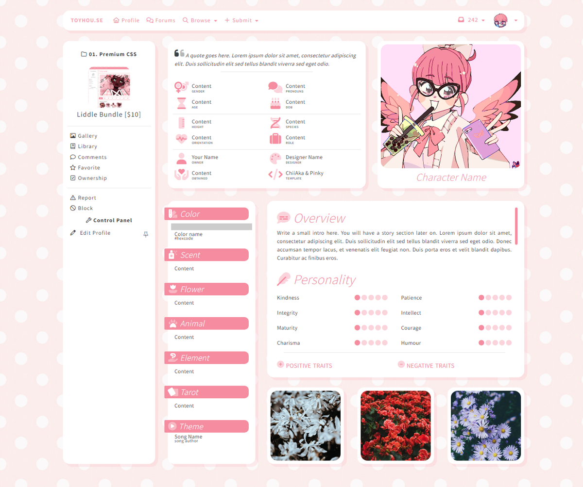
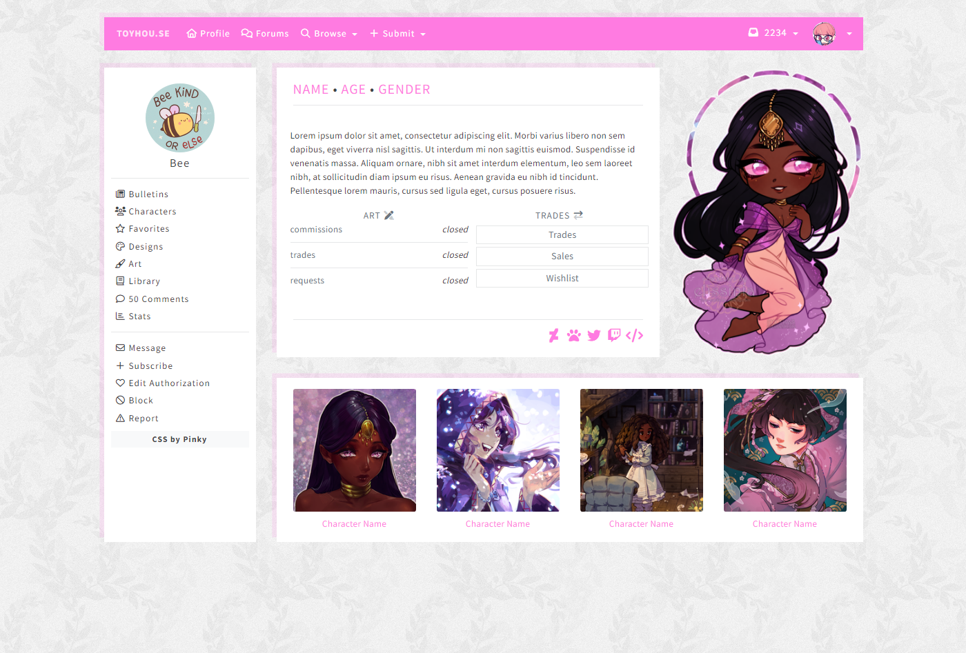
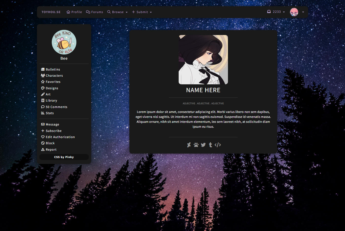
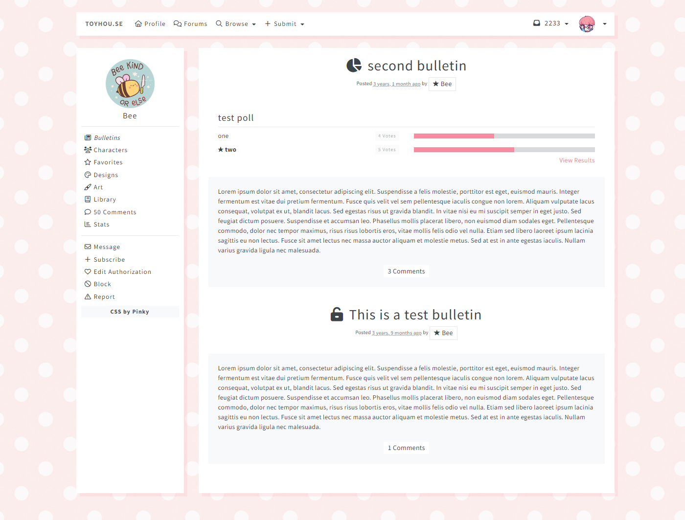
Liddle Layout
Character Previews
User Previews
Bonus: Collab HTML
HTML that was designed by other users & edited to work with my Liddle CSS.
I did not design/create the original HTML, I only did the edits to make them work properly with this CSS.
Details
- CSS works on user profiles & character profiles.
- Comes with 3 character HTML options & 3 user HTML options
- User CSS/HTML is compatible with default TH sections (featured comments, recent characters, etc)
- This is a very narrow layout - the content area is only about 850px wide.
- CSS allows you to customize...
- Background image and/or color
- Content area body color & font
- The sidebar will match the body colors
- Primary highlight color (for links & butttons)
- TH header bar background & font color
- Content area shadows
- you can set a custom box-shadow or set it to "none" to remove it
- Faded background color & muted font color
- Includes switches for
- Header info block on character pages can be turned on/off
- Character tags in the header info block can be turned on/off
- Recent images on character pages can be turned on/off
- Corners can be sharp or round (3 options)
- Less commonly used sidebar links can be turned on/off
Box Shadow
- By default the box shadow will be semi solid with a color based on the primary color
- Alternate shadow look examples:
- If you're writing custom HTML or using a template by a different creator, add the class "shadow" to your divs to give them the matching box shadow effect.
View More
Recent Images