ic glitch lol
So I realize that, even more than anatomy, my bigger art issue is composition. I think the way I draw itself is good so far, but I'd like to work on its presentation since to me it feels like it could look better but I'm unsure how ^^; I know sometimes I tend to crop my sketches or some no-bg art a lot ;; But other times when I have space it makes the drawn part feel small (hope this makes sense?) . If you want you could see my art here if it'll make some sense of my text ^^;;
So if you have or find any good composition or sketching tips/advice, I'd love to see it ^^ Thankies so much in advance☆
I was looking at this post earlier which I think has some good starting ideas. I need to be less lazy with my art now lolol ;v;
oh this is my jam
i wanna start saying that none of these apply 100% of the time, you're gonna find countless examples of people going against and making it work, but they're still a pretty solid starting point and will probably help in most cases.
in general, the goal of composition is to keep the viewers attention in the piece, and avoid things that guide the eye outside of it. composition is always built around one or more points of interest, so the basic process is: decide what you want the points of interest to be > arrange them in a favorable way. here are some basic rules for that:
- avoid having the point of interest too close to the center of the canvas (height-wise mainly). for example, in a portrait, you want the point of interest to be the eyes, so you should crop it in a way that the eyes don't land on the center line of the canvas. for vertical canvases, you generally want your point of interest to be more clearly placed in either the top half or bottom half of the canvas. for horizontal canvases, either on the left or right half.
- if you have more than one point of interest, avoid having them alined vertically or horizontally, always go for diagonals. for example, if you have a portrait of a character doing a peace sign, you want the eyes and the hand to be at different heights, ideally one on each half of the canvas.
- if you have more than one point of interest, try making them different sizes. if they're all around the same size it can kinda read as stiff. for example, if you have a piece with two characters, and each one is a point of interest, then you might want to arrange them in perspective, so one of them is bigger than the other.
- arrange points on interest throught the entire canvas. if all the important parts are concentrated in one area, and the rest of the canvas is just empty/devoid of interest, then you might as well crop that.
- avoid having points of interest touching or almost touching the edges of the canvas, give them a bit of room to breath.
- figure/background balance. you generally want to avoid the main figure and the background both occupying around the same amount of real state in the canvas. something like 70/30 or 30/70 is more like what you should aim for.
- when doing clusters of repeating elements (like confetti, trees, crumbs of food, bubbles underwater, etc) avoid having them all too evenly spaced, too close in size or too parallel with one another. if everything is too perfectly aligned it can look very stiff and distracting.
- this is more of a personal preference, but a good way to make composition feel more alive and dynamic is to have elements visually extend past the canvas borders. having everything perfectly contained can sometimes make things feel stiff and unnatural.
of course having a good arrangement is only half the way, you also want to make sure that it reads as you intended. in general, you want the point of interest to be the thing that stands out, and anything else should complement it. i personally still struggle with this quite a bit, but here are some general points:
- more details make things stand out. the level of detail that you draw something with should follow a some kind of hierarchy. points of interest should get the most attention, things in the background should get the less detail.
- contrast makes things stand out. this applies to both contrast within an element itself, and contrast between that element and the background surrounding it. the way you shade the elements in the background should have a lot less color contrast than the way you shade the main subjects. also the main subject itself should also contrast with the bg. this can be done with value (for example, have the subject be lighter than the bg) or with hue (ex. have the subject be warm and the bg cool). or both!
- sharp edges make thing stand out. kinda tied in with the above. avoid very defined edges on things that are not meant to call attention
and now, let's try apply some of that:
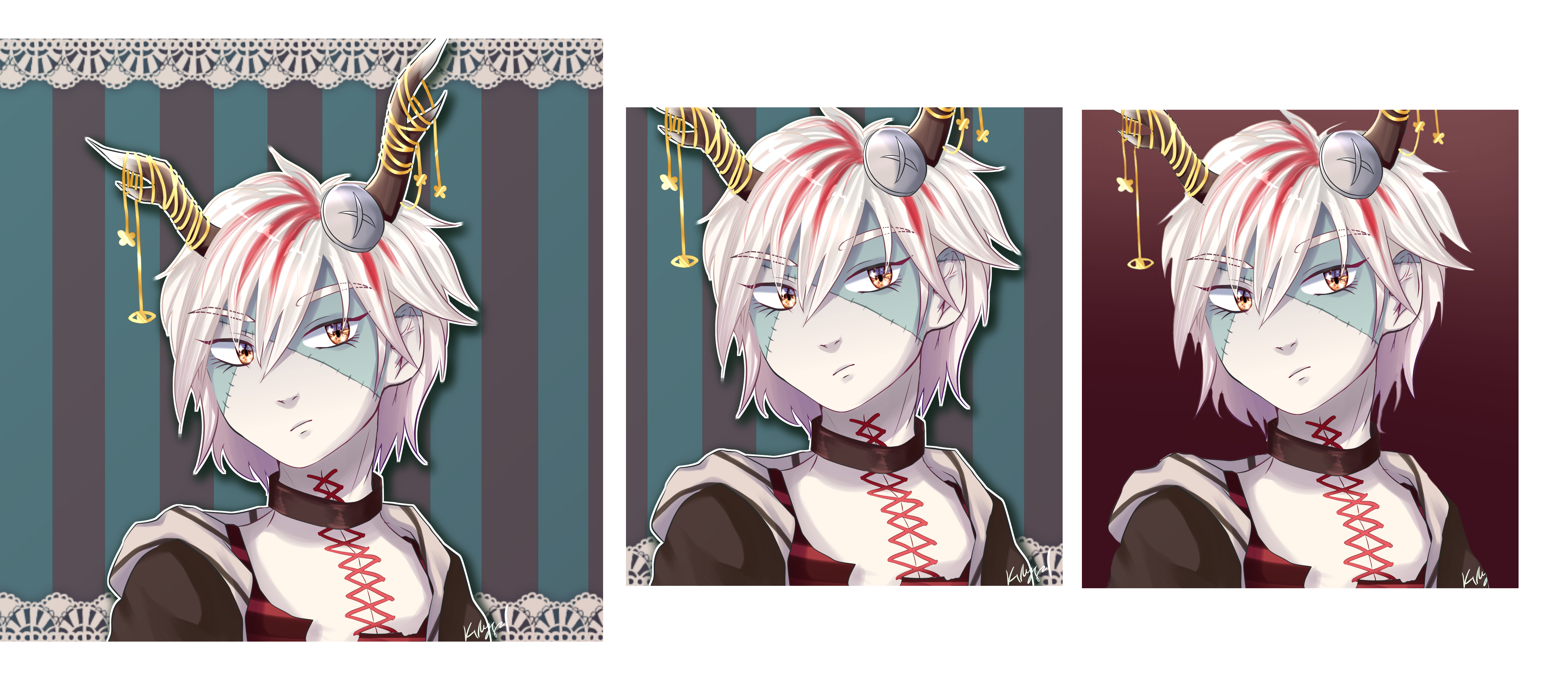
her eyes were in the center of the canvas, which you really wanna avoid for portraits, so i just recroped the image. i also felt the bg had a bit too much going on. since the character is already kinda detailed, i decided to just go for a simple gradient. i also picked a color that had more contrast with her face, so it stands out the most. also removed the white border, i felt she stood out enough with the bg change so the border didn't really help anymore.
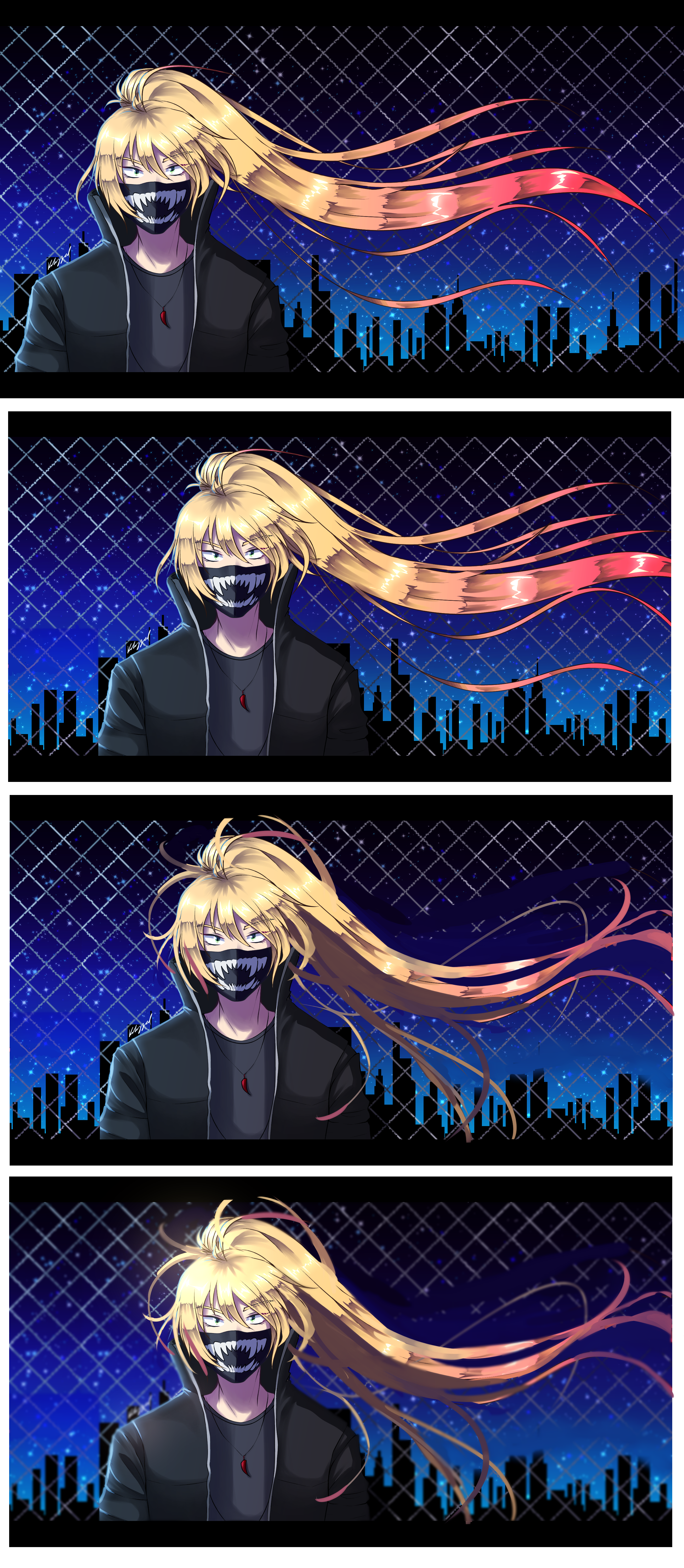
first things that stood out to me were how far to the left she was placed, and also it felt like the hair was too perfectly contained into the canvas. long hair is always a good oportunity to hace some kind of element flow outside the borders. i recroped the image and also gave her a bit more room on the left, so the main point of interest isn't so close to the edge and the whole thing is a bit more balanced. the face was again too low on the canvas so i also got rid of some of the empty space above her head.
hair strands were also looking all to similar in size and overall direction, so i added a bit more variation. i also tried to extend some hairs on the left side so it feels more balanced.
i blurred the bg so it's less distracting, and added some slight glow on the face and shoulder area, so she stands out more. i also dulled the pink on the tips of her hair cause i felt it was competing with the face. ideally i should've maybe placed them lower on the canvas so they're not so close in height to the face but i was lazy
and last, some misc advice:
- a good way to test if composition works is to see the piece as a thumbnail. if the general idea reads well even in small sizes, then you're on a good track.
- even when working with transparent bgs, always keep the imaginary canvas edges in mind. the piece should look just as good against a white background as it does on a transparent one.
i think good composition is kind of an unsung hero. most people probably won't notice it, but they'll feel it. so good for you for wanting to work on it! i hope you get something out of all this, thanks for coming to my ted talk.
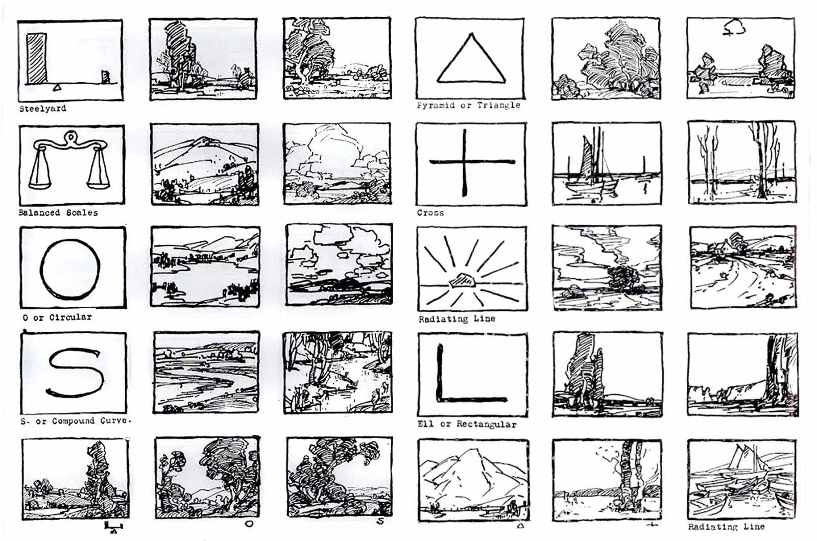
this page from edgar payne's book on composition (full size) is a really nice simple breakdown of common compositions! he used landscapes but you can apply this to any subject really. i also recommend reading molly bang's book 'picture this' (you can find pdfs online) it talks about how composition, colours and shapes create different emotions in us :)