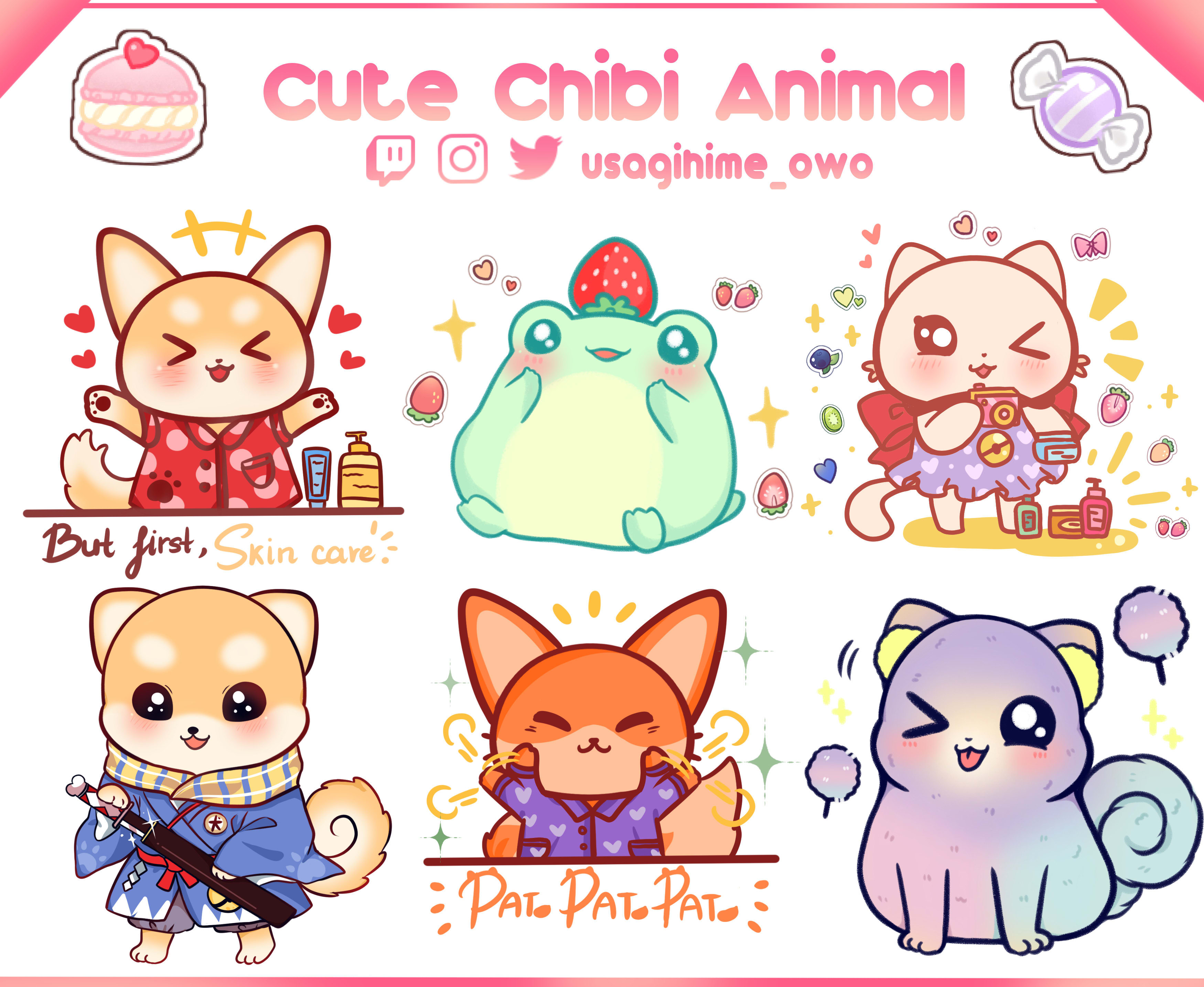
So I’m look for some criticism for my art! Here’s something I drew like ten minutes ago, any help/criticism?
Looks cute!
The gradient is nice and your shapes are clean and solid. Some critique I'd give is to not use the circle tool but instead make the head of the character more defined. Things like cheeks and a chin to help the characters form be more noticable.
Here is a random example off Google of chibi characters. You can see that the heads are more then just a flat circle but have some curves to them to define the shape. Hope this helps, keep up the good work ^^