If you want to change the colours of active (and hover) states to a specific colour, you'd have to use CSS specifically. You cannot change the colour of active/ hover states with HTML.
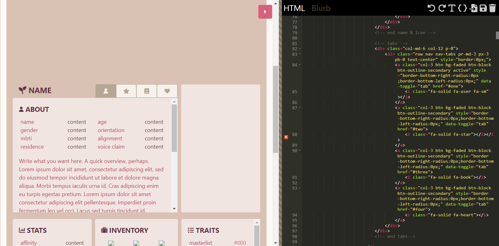
To break down your HTML for the buttons specifically:
- col-3 sets the column size (since your buttons are set into a row)
- bg-faded sets the background colour to the Bootstrap colour (this can be omitted/ removed if you plan to use CSS to change the button colours)
- btn sets the general styling of the button (border-size, border-radius, font-size, padding, etc.)
- btn-block sets the button as a block (rather than inline) and makes the button fill the whole width of its parent (this class isn't necessary to have since you're already using col-3)
- btn-outline-secondary sets the colours for the border and font, as well as the border, font and background colour for hover/ active states
Since you're using btn-outline-secondary specifically for your nav buttons, the CSS you'll want to use would be:
.nav-tabs .btn-outline-secondary {
background-color:HEXCODE;
border-color:HEXCODE;
color:HEXCODE;
}
.nav-tabs .btn-outline-secondary.active {
background-color:HEXCODE;
border-color:HEXCODE;
color:HEXCODE;
}
.nav-tabs .btn-outline-secondary:hover {
background-color:HEXCODE;
border-color:HEXCODE;
color:HEXCODE;
}
With this, you're targeting the elements with the .btn-outline-secondary class inside your nav-tabs container.
The first target sets the colours of the buttons as they are normally.
The second target sets the colours of the buttons when they have the .active class (i.e. when the button is active/ selected)
The third target sets the colours of the buttons when the mouse is hovered over them.