Profile
What is alt text?
"Alt" is a HTML attribute for <img> tags. If an image doesn't appear for whatever reason (e.g. there's an error, the image was deleted and no longer exists, or the user has images disabled), its alt text appears instead.
The HTML for an image without alt text looks like this:
<img src="image_url.jpg">
And the HTML for an image with alt text looks like this:
<img src="image_url.jpg" alt="this is the text that appears when the image doesn't load.">
If someone can't see the image, they can at least read the alt text, and ideally this means they can still enjoy the page without getting confused or lost. Recently on the internet, lots of people have been adding alt text to their images in the name of accessibility. And it's wonderful that people care so much about making their webpages accessible! But... it seems that most of these people don't know much about how to write helpful alt text.
I can't claim to be an expert in accessibility either, but I've done a decent amount of research for my own website, & some friends expressed interest in seeing this guide when I floated the idea. So here's some basic alt text guidelines to make a nice accessible experience for everyone.
Alt text best practices
1. Keep it short

Bad: alt="a black and white drawing of squidlegs in binary pen. squidlegs is a small creature which resembles a squid but with two cartoon legs instead of tentacles. it has a white body and two beady black eyes. it is facing the camera and posed so that it is dancing, with its right leg outstretched and its left leg bent. there is a quarter note floating to its left and two quarter notes floating to its right."
Good: alt="squidlegs dancing to music"
Keep your alt text as short and to-the-point as possible. Alt text is meant to be a simple quick replacement for an image, not a full image description.
Online guides recommend a few different maximum lengths, but I would say keep it less than 100 characters. If it's longer than that, some screen readers simply cut off, while others prompt the user if they want to continue every 100-200 characters. Either way, it's very annoying.
If you think it's important for your audience to know exactly what your character looks like, consider putting an "appearance" section in their bio, or writing a full image description in a spoiler. That way, everyone can read and benefit from this long description, even if the image doesn't fail!
2. Use empty alt for decorative images

Sometimes, squidlegs sits down and stares into the distance. It's possible that it's contemplating its mysterious life, but nobody knows for sure.
Bad: alt="squidlegs sitting down"
Good: alt=""
Aesthetic images, borders/dividers, and images that are already described by the text around them should not be described in the alt text. Add alt="", making sure there aren't any spaces or other characters between the quotation marks, to mark them as decorative. This makes them disappear unobstrusively from screen reader outputs.
If possible, try to include decorative images as background images instead of using <img> tags. That way you don't have to add an alt attribute at all.
3. If the image contains text, transcribe it
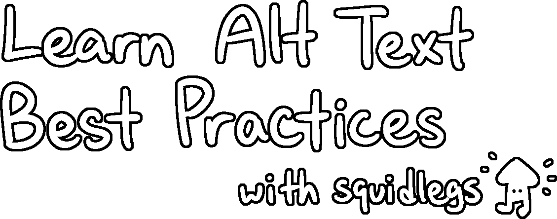
Bad: alt="Handwritten title for alt text guide with squidlegs in the corner"
Good: alt="Learn Alt Text Best Practices with squidlegs"
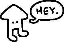
Okay: alt="squidlegs welcomes you to the page."
Also Okay: alt="squidlegs says 'Hey.'"
(Depends on the context / personal preference.)
If you have an image of text (e.g. a fancy header graphic), transcribe it in the alt text. Don't paraphrase or summarize, and don't describe the style of the image. If your image contains a lot of text (e.g. a screenshot of a tumblr post), consider just copying the text onto your page instead of using an image. It's easier for everyone to read that way.
If your image contains both text and visual elements interacting with each other (e.g. a diagram or a comic), it's more important to convey the meaning of the image than transcribe word-for-word. Use your best judgement.
4. Prioritize describing the image's function

Bad: alt="a left-facing arrow that resembles squidlegs' head"
Good: alt="back to octopi's codes"
Bad: alt="back to octopi's codes"
Good: alt=""
If an image serves as a link or a button, the alt text should tell the user what the button does, rather than what it's shaped like.
If there is also text in the link that explains its function, the image counts as decorative. Use an empty alt as described in #2.
Other guides & resources
I've tried to keep this guide short for readability. Some things have been left out, since I figured most people probably aren't putting complex bar charts on toyhouse. If you're interested in learning more, here are a few resources I recommend:
- Web Accessibility Initiative's Images Tutorial - the ultimate alt text guide with plenty of examples
- Cooper Hewitt Guidelines for Image Description - this one is more focused on image descriptions, but it does have many excellent examples for describing art, which I think is very relevant to the toyhou.se crowd
- Against Access by John Lee Clark - this isn't technically a resource; it's an essay about the state of internet accessibility by a DeafBlind person. but I think it's very insightful, and worth a read for anyone who strives for accessibility in their internet content.
Good luck & have fun on your alt text journey!
Recent Images
No images.