Ultimate Coding Resource - V.1
JINIPPYBASILE
- Created
- 2 months, 5 days ago
- Creator
- JINIPPYBASILE
- Favorites
- 1199
- Trade Listing
-
Free
Profile
CLASSES
- Cards
- Buttons
- Badges
- Loading bars
- Word ---- Word
- Icons
- Mx-auto
- Padding
- Margins
- Rows
- Columns
- Column friendliness
- Justify-content
- Tabs
- Collapsing text
- Carousels
- Accordions
- Tooltipsters
STYLE
- Colors
- Bootstrap colors
- Opacity
- Height and width
- Overflow-x/-y
- Position:absolute
- Background images
- Dropshadow
- Layers/z-index
- Animation
- Bolding, italics, etc.
- Fonts
- Font sizing/spacing
- Font colors
- Border types
- Border-radius
SOURCESE AND HREF
MISCELLANEOUS
MY TIPS/TRICKS
Please send a comment if you would like something added to this coding reference! I want this to be the most complete coding guide possible.
So basically, when I started coding, what really helped me was a lot of coding directories and forum questions that really taught me a lot about HTML coding on Toyhou.se. A lot of these guides have interesting tidbits of information, but since they are really spread apart, it's hard to easily refer to them.
Also, there are not a lot of guides out there for all the amazing code things you can do on TH! I thougth that perhaps, I can complie a code "masterlist", per se, so that all the HTML stuff that you can do on TH is easily accessible through a single point .
This is made for myself as I often like to refer to guides as I code so I can easily access certain stuff, but everyone is free to use this!
This guide is free to use and can be used by anyone! If you would like to support my coding/art work on TH, it would mean so much to me! Check out the link below for some of my coding work :D I have also added in some links to other sources that helped me learn to code- go check them out!! Also great thanks to people such as Aurorean, Elithian, H0NEYP1E, NebulaNumbat, and more for making previous guides on what was possible with Toyhou.se HTML! I learned so much from all of your vuides, and I hope to that this masterlist helps pay hommage to all your efforts!
This isn't a tutorial on how to learn to code, this is just a place where all the stuff you can do to code is compiled. Perhaps I will make a 100% beginner tutorial to get started on hobby coding in the future when my skills are further developed.
26/02/2024, 6:45 PM PST: Coding masterlist V.1 is released publically, added table of contents
CLASSES
This basically tells the code what kind of thing you're making.
Cards
Buttons
Badges
Loading bars
Progress bar (0%)
Progress bar (50%)
Progress bar (100%)
Note: If you want to change the percentage, just change the style='width: _____%;" to whatever numerical value you want.
Decimal values (ex. 10.7%, 56.9%,) work too!
Progress bar with text inside
Animated progress bar (50%)
Word ------ Word
Solid line
Dotted line
Icons
Note: You can find coool icons at fontawsome.com.
Solid icon <i class="fa-solid fa-heart"></i>
Regular icon <i class="fa-regular fa-heart"></i>
Light icon <i class="fa-light fa-heart"></i>
Duotone icon <i class="fa-duotone fa-heart"></i>
Thin icon <i class="fa-thin fa-heart"></i>
Brand icon <i class="fa-brands fa-discord"></i>
Sizes of icons
<i class="fas fa-square fa-sm"></i>
<i class="fas fa-square fa-lg"></i>
<i class="fas fa-square fa-2x</i>
<i class="fas fa-square fa-4x"></i>
<i class="fas fa-square fa-8x"></i>
<i class="fas fa-square fa-10x"></i>
<span style="font-size:0.7rem"><i class="fas fa-square"></i></span>
Note: The last one corresponds to the font size you use, make sure to edit the style="font-size: __rem;" accordingly!
Icons as a bullet
- This list has a FA icon as bullet.
- Multiple FA icons can be used in the same list.
- ✓You can also use non-FA characters in this code!
<li><span class="fa-li"><i class="fal fa-square"></i></span>This list has a FA icon as bullet.</li>
<li><span class="fa-li"><i class="fal fa-circle"></i></span>Multiple FA icons can be used in the same list.</li>
<li><span class="fa-li">✓</span>You can also use non-FA characters in this code!</li>
</ul>
Rotating icons
<i class="fa-regular fa-cheese-swiss"></i>
<i class="fa-regular fa-cheese-swiss fa-rotate-90"></i>
<i class="fa-regular fa-cheese-swiss fa-rotate-180"></i>
<i class="fa-regular fa-cheese-swiss fa-rotate-270"></i>
<i class="fa-regular fa-cheese-swiss fa-flip-horizontal"></i>
<i class="fa-regular fa-cheese-swiss fa-flip-vertical"></i>
<i class="fa-regular fa-cheese-swiss fa-flip-both"></i> </div>
Animated icons icons
Spin
<i class="fas fa-cheese fa-spin"></i>
Pulse
<i class="fas fa-cheese fa-pulse"></i>
Beat
<i class="fas fa-cheese fa-beat"></i>
Fade
<i class="fas fa-cheese fa-fade"></i>
Beat-fade
<i class="fas fa-cheese fa-beat-fade"></i>
Bounce
<i class="fas fa-cheese fa-bounce"></i>
Flip
<i class="fas fa-cheese fa-flip"></i>
Shake
<i class="fas fa-cheese fa-shake"></i>
Stacking icons on top of each other
<span class="fa-stack fa-2x">
<i class="fa-solid fa-circle fa-stack-2x"></i>
<i class="fa-regular fa-cheese-swiss fa-stack-1x fa-inverse"></i>
</span>
<span class="fa-stack fa-2x">
<i class="fa-solid fa-circle fa-stack-2x" style="color:rgb(230,230,230)"></i>
<i class="fa-regular fa-cheese-swiss fa-stack-1x fa-inverse" style="color:rgb(0,0,0)"></i>
</span>
Mx-auto
Card that uses mx-auto for text
Note: play around with mx-___ values to change the margins of the text/cards!
Padding
Margins
Rows
Row with gutters
<div class="card p-1 col-6"> Content</div>
<div class="card p-1 col-6"> Content</div>
</div>
Row with no gutters
<div class="card p-1 col-6">Content</div>
<div class="card p-1 col-6">Content</div>
</div>
Columns
Note: If the sum of the columns in a row exceeds 12, the column will spill over into another row.
Also, columns may work weird on mobile, so refer to mobile/tablet friendliness sections for that kind of info.
<div class="card col-2 p-1"> col-2</div>
<div class="card col-3 p-1"> col-3</div>
<div class="card col-4 p-1"> col-4</div>
<div class="card col-6 p-1"> col-6</div>
<div class="card col-12 p-1"> col-12</div>
<div class="card col-1 p-1">col-1 </div>
<div class="card col-11 p-1">col-11 </div>
</div>
<div class="card col-2 p-1">col-2 </div>
<div class="card col-10 p-1">col-10 </div>
</div>
<div class="card col-9 p-1">col-9</div>
<div class="card col-8 p-1">col-8 </div>
<div class="card col-7 p-1">col-7 </div>
Mobile + tablet friendliness
Note: If col-md-x and col-y are present, this means that col-md-x corresponds to the column on computer and col-y corresponds to the column on mobile.
If col-md-x and col-lg-y and col-z are present, this means that col-md-x refers to the column on tablet, col-lg-y refers to the column on computer, and col-z on mobile.
col-md-6 will be col-12 on mobile and col-6 on desktop
<div class="col-md-6 p-1">
<div class="bg-faded p-3">
<p align="center">col-md-6 will be col-12 on mobile and col-6 on desktop</p>
</div>
</div>
</div>
col-md-6 col-lg-8 col-4 will be col-6 on a tablet, col-8 on a desktop, and col-4 on mobile
<div class="col-md-6 col-4 p-1">
<div class="bg-faded p-3 h-100">
<p align="center">col-md-6 col-lg-8 col-4 will be col-6 on a tablet, col-8 on a desktop, and col-4 on mobile </p>
Justify content
Justify-content-around
<span>Value 1</span>
<span>Value 2</span>
<span>Value 3</span>
<span>Value 4</span>
<span>Value 5</span>
</div>
Justify-content-between
<span>Value 1 </span>
<span>Value 2 </span>
<span>Value 3 </span>
<span>Value 4 </span>
<span>Value 5 </span>
</div>
Tabs (vertical and horizontal)
Horizontal tabs
<li class="col-md-4 mb-1"><a class="btn bg-faded btn-block btn-outline-secondary active" data-toggle="tab" href="#reg1">Tab1</a></li>
<li class="col-md-4 mb-1"><a class="btn bg-faded btn-block btn-outline-secondary" data-toggle="tab" href="#reg2">Tab2</a></li>
<li class="col-md-4 mb-1"><a class="btn bg-faded btn-block btn-outline-secondary" data-toggle="tab" href="#reg3">Tab3</a></li>
</ul>
<div class="tab-content">
<div class="tab-pane fade active show" id="reg1">
<div class="card p-3">
<div class="p-3">Text1 </div>
</div>
</div>
<div class="tab-pane fade" id="reg2">
<div class="card p-3">
<div class="p-3">Text2 </div>
</div>
</div>
<div class="tab-pane fade" id="reg3">
<div class="card p-3">
<div class="p-3">Text3 </div>
</div>
</div>
</div>
Vertical tabs
<div class="col-md-3 px-3 mb-3">
<ul class="nav nav-tabs row card-header-tabs">
<li class="col-12 mb-1"><a class="btn bg-faded btn-block btn-outline-secondary active" data-toggle="tab" href="#vert1">Tab1</a></li>
<li class="col-12 mb-1"><a class="btn bg-faded btn-block btn-outline-secondary" data-toggle="tab" href="#vert2">Tab2</a></li>
<li class="col-12 mb-1"><a class="btn bg-faded btn-block btn-outline-secondary" data-toggle="tab" href="#vert3">Tab3</a></li>
</ul>
</div>
<div class="col-md-9">
<div class="tab-content">
<div class="tab-pane fade active show" id="vert1">
<div class="card p-3">
<div class="p-3">Text1</div>
</div>
</div>
<div class="tab-pane fade" id="vert2">
<div class="card p-3">
<div class="p-3">Text2</div>
</div>
</div>
<div class="tab-pane fade" id="vert3">
<div class="card p-3">
<div class="p-3">Text3</div>
</div>
</div>
</div>
</div>
</div>
</div>
Collapsing text
Note: Rename the id to something specific for multiple collapses all at once, or the collapses will not show properly.
Toggle above collapse
<div id="topcollapse" class="collapse">
Toggle above collapse text
</div>
<div id="bottomcollapse" class="collapse">
Toggle underneath collapse text </div>
<a href="#bottomcollapse" data-toggle="collapse">Toggle underneath collapse</a>
Text between toggle and collapse
<div>Text between the toggle and the collapse</div>
<div id="betweencollapse" class="collapse">
Text of the collapse
</div>
Carousels
<div class="carousel-inner">
<div class="carousel-item active">
<div style="background-image:url(Link to photo);height:400px;background-position:center center;background-size:cover"></div>
</div>
<div class="carousel-item">
<div style="background-image:url(Link to photo);height:400px;background-position:center center;background-size:cover"></div>
</div>
<div class="carousel-item">
<div style="background-image:url(Link to photo);height:400px;background-position:center center;background-size:cover"></div>
</div>
</div>
</div>
<div class="carousel-inner">
<div class="carousel-item active">
<div style="background-image:url(Link to photo);height:400px;background-position:center center;background-size:cover"></div>
</div>
<div class="carousel-item">
<div style="background-image:url(Link to photo);height:400px;background-position:center center;background-size:cover"></div>
</div>
<div class="carousel-item">
<div style="background-image:url(Link to photo);height:400px;background-position:center center;background-size:cover"></div>
</div>
</div>
<a class="carousel-control-prev" href="#carousel2" role="button" data-slide="prev">
<span class="carousel-control-prev-icon" aria-hidden="true"></span>
<span class="sr-only">Previous</span>
</a>
<a class="carousel-control-next" href="#carousel2" role="button" data-slide="next">
<span class="carousel-control-next-icon" aria-hidden="true"></span>
<span class="sr-only">Next</span>
</a>
</div>
</div>
<ol class="carousel-indicators">
<li data-target="#carousel3" data-slide-to="0" class="active"></li>
<li data-target="#carousel3" data-slide-to="1"></li>
<li data-target="#carousel3" data-slide-to="2"></li>
</ol>
<div class="carousel-inner">
<div class="carousel-item active">
<div style="background-image:url(Link to photo);height:400px;background-position:center center;background-size:cover"></div>
</div>
<div class="carousel-item">
<div style="background-image:url(Link to photo);height:400px;background-position:center center;background-size:cover"></div>
</div>
<div class="carousel-item">
<div style="background-image:url(Link to photo);height:400px;background-position:center center;background-size:cover"></div>
</div>
</div>
<a class="carousel-control-prev" href="#carousel3" role="button" data-slide="prev">
<span class="carousel-control-prev-icon" aria-hidden="true"></span> <span class="sr-only">Previous</span>
</a>
<a class="carousel-control-next" href="#carousel3" role="button" data-slide="next">
<span class="carousel-control-next-icon" aria-hidden="true"></span> <span class="sr-only">Next</span>
</a>
</div>
<div class="carousel-inner">
<div class="carousel-item active">
<div style="background-image:url(Link to photo);height:400px;background-position:center center;background-size:cover"></div>
<div class="carousel-caption d-none d-md-block">
<div class="p-1" style="background-color:rgba(250,250,250,0.5);color:rgb(0,0,0)"><p> <span style="font-size:3rem">Title</span>
<br>Caption text</p></div>
</div>
</div>
<div class="carousel-item">
<div style="background-image:url(Link to photo);height:400px;background-position:center center;background-size:cover"></div>
<div class="carousel-caption d-none d-md-block">
<div class="p-1" style="background-color:rgba(250,250,250,0.5);color:rgb(0,0,0)"><p> <span style="font-size:3rem">Title</span>
<br>Caption text</p></div>
</div>
</div>
</div>
<a class="carousel-control-prev" href="#carousel4" role="button" data-slide="prev">
<span class="carousel-control-prev-icon" aria-hidden="true"></span>
<span class="sr-only">Previous</span>
</a>
<a class="carousel-control-next" href="#carousel4" role="button" data-slide="next">
<span class="carousel-control-next-icon" aria-hidden="true"></span>
<span class="sr-only">Next</span>
</a>
</div>
Accordions
Note: By removing the 'show' part from "class="collapse show"", all collapses start out closed.
<div>
<div class="card p-3 mb-2" role="tab" id="headingclosed1">
<a data-toggle="collapse" data-parent="#allclosed" href="#allclosed1" aria-expanded="false" aria-controls="allclosed1">
<div class="mb-0">
Solo accordion
</div>
</a>
</div>
<div id="allclosed1" class="collapse" role="tabpanel" aria-labelledby="headingclosed1" data-parent="#allclosed">
<div class="card-body p-3">
Content
</div>
</div>
</div>
</div>
</div>
<div>
<div class="card p-3 mb-2" role="tab" id="heading1">
<a data-toggle="collapse" data-parent="#accordion" href="#accordion1" aria-expanded="true" aria-controls="accordion1">
<div class="mb-0">
First accordion
</div>
</a>
</div>
<div id="accordion1" class="collapse show" role="tabpanel" aria-labelledby="heading1" data-parent="#accordion">
<div class="card-body p-3"> Initially loaded text in the first accordion collapse
</div>
</div>
</div>
<div>
<div class="card p-3 mb-2" role="tab" id="heading2"> <a class="collapsed" data-toggle="collapse" data-parent="#accordion" href="#accordion2" aria-expanded="false" aria-controls="accordion2">
<div class="mb-0">
Second accordion
</div>
</a>
</div>
<div id="accordion2" class="collapse" role="tabpanel" aria-labelledby="heading2" data-parent="#accordion">
<div class="card-body p-3">
Text in the second accordion collapse
</div>
</div>
</div>
<div>
<div class="card p-3 mb-2" role="tab" id="heading3">
<a class="collapsed" data-toggle="collapse" data-parent="#accordion" href="#accordion3" aria-expanded="false" aria-controls="accordion3">
<div class="mb-0">
Third Accordion
</div>
</a>
</div>
<div id="accordion3" class="collapse" role="tabpanel" aria-labelledby="heading3" data-parent="#accordion">
<div class="card-body p-3">
Text in the third accordion collapse
</div>
</div>
</div>
</div>
Tooltipster
Text with a tooltip.
<p>Text with <span class="tooltipster" title="This is the text of the tooltip">a tooltip.</span> </p>Note: I am not sure how to add 100% working tooltipsters to images, cards, etc. but will do so when I am more confident!
STYLE
This basically tells the code how to personalize + make your code look pretty.
Colors
Note: There are two ways of getting custom colors on TH: through the rgba system and through hex codes.
<div class="card p-2" style="background-color:rgba(176,11,105)">rgba(176,11,105) card</div>
<div class="card p-2" style="background-color:#B00A65">#B00A65 card</div>
Bootstrap Colors
Note: Bootstrap colors are basically all the preset colors use can use in TH. Bootstrap colors vary depending on the theme one uses.
<div class="card card-primary col-md-6 col-12 p-2"> Primary card </div>
<div class="card card-info col-md-6 col-12 p-2"> Info card </div>
<div class="card card-success col-md-6 col-12 p-2"> Success card </div>
<div class="card card-warning col-md-6 col-12 p-2"> Warning card</div>
<div class="card card-danger col-md-6 col-12 p-2"> Danger card </div>
<div class="card col-md-6 col-12 p-2"> Regular card </div>
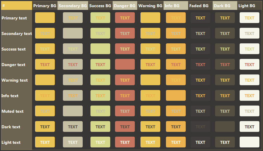
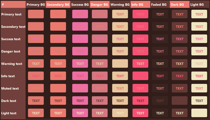
Table for all comparisons for bootstrap colors depending on theme (credit to SparklyCodes):
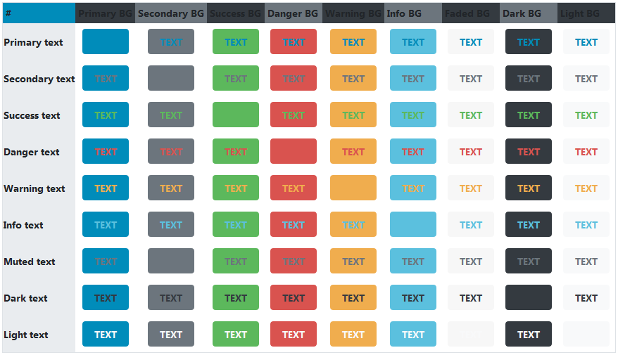
Night theme
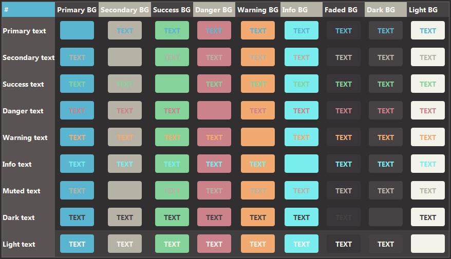
pink is the best color sorry i don't make the rules
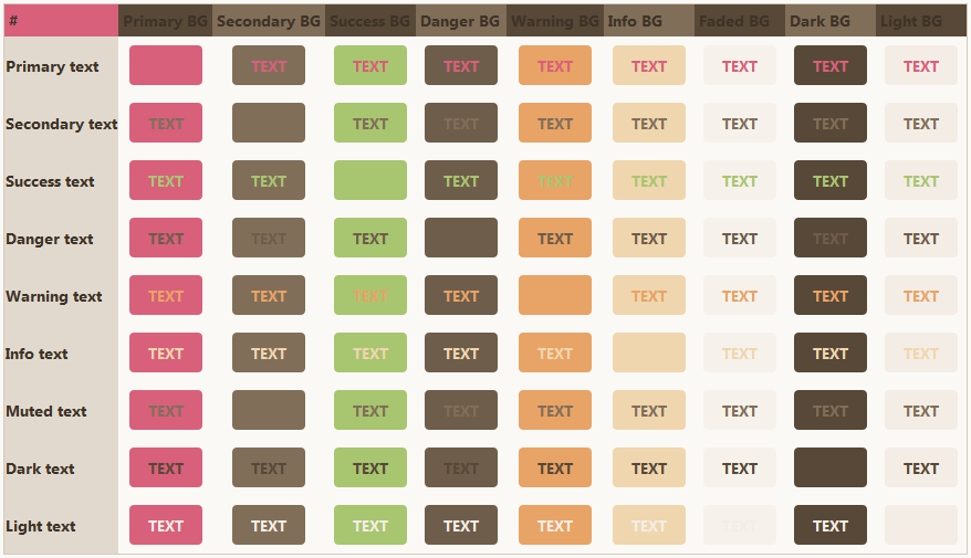
what?? teal is clearly the superior color
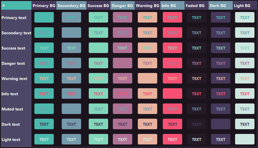
According to all known laws of aviation, there is no way a bee should be able to fly. Its wings are too small to get its fat little body off the ground. The bee, of course, flies anyway. Because bees don't care what humans think is impossible.
Pink Velvet Snake
Opacity
Note: Opacity can only be achieved through using rgba by adding a, namely opacity, value to the color. The opacity can range from 0-1, with 0 being completely transparent to 1 being not transparent at all.
<div class="card p-2" style="background-image:url(Link to photo)">
<div class="card p-2" style="background-color:rgba(235,235,235,0.5)"> Card with 50% opacity and background</div>
</div>
Height and width
Note: Max-height sets up a maximum height for the card, so if the maximum is not met, it will automatically just set it to the smallest value possible.
Overflow-y/Overflow-x
Note: This allows for you to create a scrollable card. However, it is not possible to easily hide the scrollbar without CSS. A specific height/width must be set for this to work!
Card with overflow-y
Lorem ipsum dolor sit amet, consectetur adipiscing elit. Donec accumsan, ex sit amet rutrum ultrices, ligula diam pellentesque ante, sit amet facilisis metus libero eget purus. Nunc fringilla, lectus ut egestas tristique, eros quam porta dui, quis hendrerit nisi erat et dui. Aenean pulvinar fermentum ligula nec ultrices. Quisque bibendum ut neque et elementum. Duis placerat aliquet rhoncus. Suspendisse pretium tellus et rutrum placerat. Curabitur feugiat nibh non enim condimentum auctor. Aliquam erat volutpat. Phasellus porta vulputate mattis.
<p>Card with overflow-y </p>
</div>
Card with overflow-x
Lorem ipsum dolor sit amet, consectetur adipiscing elit. .
Lorem ipsum dolor sit amet, consectetur adipiscing elit.
Lorem ipsum dolor sit amet, consectetur adipiscing elit.
Lorem ipsum dolor sit amet, consectetur adipiscing elit.
Lorem ipsum dolor sit amet, consectetur adipiscing elit.
Lorem ipsum dolor sit amet, consectetur adipiscing elit.
<p>Card with overflow-x </p>
</div>
Position:absolute
Note: Be warned that using position:absolute may lead to wonky layouts on mobile, so make sure to consider this + check for mobile friendliness as you use this!
Note: Position-absolute allows you to also go beyond the scope of the character description and minimally add stuff across the entire screen. For example if you want to put a small icon next to the character's image at the top of the page, you can use the following directions to do so:
<span class="fa-regular fa-cheese-swiss" style="font-size:15px; position:absolute; left: 5rem; top: 1rem;">
</span>
Background images
Note: The following code can be added to the style="______" to further customize the background image. Some can be used at the same.
Background-size:
Background-position:
Background-attachment:
Lorem ipsum dolor sit amet, consectetur adipiscing elit.
Background-repeat:
Dropshadow
<div class="card" style="max-width:200px; height:150px; background-size:cover; background-position:top center; background-repeat:no-repeat; box-shadow:0 0 1rem #000; background-image:url('Link to photo');"></div>
 <img src="Link to photo" style="filter:drop-shadow(0 0 3px #000);"></div>
Layers/z-index
Note: This allows you to layer elements that normally aren't be layered, some usage/understanding of position:absolute may be necessary. Can be applied to not just cards, but other elements as well! Just add: z-index: ____ to the style="____" aspect of the element. The larger the number, the more on top it will be.
Z-index with Cards
<div class="card p-2 col-7" style="z-index:0"> Card 1</div> <div class="card p-2 col-6" style="position:absolute;bottom:165px;right:20px; z-index:1"> Card 2</div>
Animation
Note: Somehow you can add some font-awesome class stuff to the class of the thing you want to animate, it works! I am not sure if this works on other sites.
Bolding, italics, etc.
This is regular text.
<p>This is regular text.</p>This is bolded text.
<p><b>This is bolded text.</b></p>This is italics text.
<p><i>This is italics text.</i></p>This is underlined text.
<p><u>This is underlined text.</u></p>This is striked-through text.
This is subscript text.
<p><sub>This is subscript text.</sub></p>This is superscript text.
<p><sup>This is superscript text.</sup></p>Fonts
Note: These are the only fonts that are freely used by Toyhou.se, if you want to upload custom fonts you must use CSS.
Arial
<p style="font-family:arial">Arial</p>Verdana
<p style="font-family:Verdana">Verdana</p>Helvetica
<p style="font-family:Helvetica">Helvetica</p>Tahoma
<p style="font-family:Tahoma">Tahoma</p>Trebuchet MS
<p style="font-family:Trebuchet MS">Trebuchet MS</p>Times New Roman
<p style="font-family:Times New Roman">Times New Roman</p>Georgia
<p style="font-family:Georgia">Georgia</p>Garamond
<p style="font-family:Garamond">Garamond</p>Courier New
<p style="font-family:Courier New">Courier New</p>Brush Script MT
<p style="font-family:Brush Script MT">Brush Script MT</p>Andale mono
<p style="font-family:Andale mono">Andale mono</p>arial black
<p style="font-family:arial black">arial black</p>book antiqua
<p style="font-family:book antiqua">book antiqua</p>calibri
<p style="font-family:calibri">calibri</p>comic sans ms
<p style="font-family:comic sans ms">comic sans ms</p>impact
<p style="font-family:impact">impact</p>symbol
<p style="font-family:symbol">symbol</p>terminal
<p style="font-family:terminal">terminal</p>Webdings
<p style="font-family:webdings">Webdings</p>wingdings
<p style="font-family:wingdings">wingdings</p>Font sizing/spacing
Font size 2rem <span style="font-size:2rem">2rem</span>
32px <span style="font-size:32px">32px</span>
16px <span style="font-size:16px">16px</span>
8px <span style="font-size:8px">8px</span>
smaller <span style="font-size:smaller">smaller</span>
small <span style="font-size:small">small</span>
larger <span style="font-size:larger">larger</span>
large <span style="font-size:large">large</span>
Font weight
Headings
Heading 1
<h1>Heading 1</h1>Heading 2
<h2>Heading 2</h2>Heading 3
<h3>Heading 3</h3>Heading 4
<h4>Heading 4</h4>Heading 5
<h5>Heading 5</h5>Heading 6
<h6>Heading 6</h6>Font spacing
Font colors (bootstrap, custom, and shadows)
Bootstrap colors text
This is primary text
<p class="text-primary">This is primary text</p>This is info text
<p class="text-info">This is info text</p>This is success text
<p class="text-success">This is success text</p>This is warning text
<p class="text-warning">This is warning text</p>This is danger text
<p class="text-danger">This is danger text</p>
This is regular color text
<p>This is regular color text</p>This is secondary text
<p class="text-secondary">This is secondary text</p>This is muted text
<p class="text-muted">This is muted text</p>This is dark text
<p class="text-dark">This is dark text</p>This is light text
<p class="text-light bg-dark" >This is light text</p>This is custom-colored #B00A65 text.
<p style="color:#B00A65;">This is custom-colored #B00A65 text.</p>This is transparent text.
<p style="rgba(235,235,235,0)">This is transparent text.</p>This is text with a text shadow.
<p style="text-shadow:1px 1px 1px #000;">This is text with a text shadow.</p>
Note: For text-shadow, the first px value refers to how much pixels it shifts on the x-axis. The second px value refers to how much pixels it shifts on the y-axis. The thrid px value refers to how much gaussian blur there is.
Border types
Border-radius
SOURCES AND HREF
This basically tells the code what kinds of images/sources to link to. It can be both external and internally
Img src
Alt
Note: Alt text is something that shows up when the website/Toyhou.se somehow can't load your photo. In this case, if the alt is "Image alt", this text will show up if the image does not load.
Href (external and internal)
External link to James Bond website <a href="Link to website"> External link to James Bond website </a>
Note: href allows you to link internally, but the element you want to link to must have id =" ______" while the internal link must have href "#________" for this to work.
Internal link to "Accordions" section of this code <a href="#link"> Internal link to "link" section of this code </a>
Music player
Note: Great thanks and kudos to this tutorial made by K90-Nyel ! This is just a basic showcase of the music player, but if you want a more detailed music player tutorial/walkthrough, go check out their tutorial!
Standard music player <audio controls=""><source src=" MP3 link here"></audio>
Looping music player <audio controls="loop"><source src=" MP3 link here"></audio>
Miscellaneous
Some miscellaneous stuff that I can't fit anywhere, but is also very useful
Lists
Regular list
- Item one
- Item two
- Item three
<li>Item one</li>
<li>Item two</li>
<li>Item three</li>
</ul>
Numbered list
- Item one
- Item two
- Item three
<li>Item one</li>
<li>Item two</li>
<li>Item three</li>
</ol>
List with extra information
- Item one
- - Item one description
- Item two
- - Item two description
- Item three
- - Item three description
<dt>Item one</dt>
<dd>- Item one description</dd>
<dt>Item two</dt>
<dd>- Item two description</dd>
<dt>Item three</dt>
<dd>- Item three description</dd>
</dl>
Flags
Note: This pride flag tutorial made by VynxCodes is what inspired me to find out that flags can be made using the d-flex linline-rounded-block as a base. You will have to manually edit the flag colors yourself and add the appropriate images if you want to customize it. Pride flags are fully listed in the pride flag tutorial above, but you can repurpose them to make country/any other type of flag!
French flag (example)
Canada flag (example)
Writing code as text
Say that you have this line of code: <div class="card p-2"></div>, but you want to write it as text instead of code when WYSIWYG is turned off.
To do so, replace "<" with <, and ">" with >.To write the above code snippet as text, it would look something like this: <div class="card p-2"></div>,
MY TIPS/TRICKS
Some tips and tricks I gained throuougt my coding journey. I will be providing examples + explanations, but I won't add the code itself, as it only really applies to that specific example.
Hiding scroll bars without CSS
Note: Basically what I will be doing to hide the scroll bar without CSS is to first put a card around the card you want to croll, then use position:absolute to orient a card to "hide" the scroll bar. This may look wonky on mobile but with enough patience and testing, it is possible to make it look seamless.
My tip is to choose a card padding that is very large (either p-4 or p-5) so that none of the text gets accidentally covered by the scrollbar-hiding card. Then, in the description of this card that encircles the card you want to scroll, create the card that you want to use to hide the scroll bar. Set it to the appropriate height, and use position-absolute to move it around and hide the scroll bar!
Non-covered scroll bar card
Covered scroll bar card
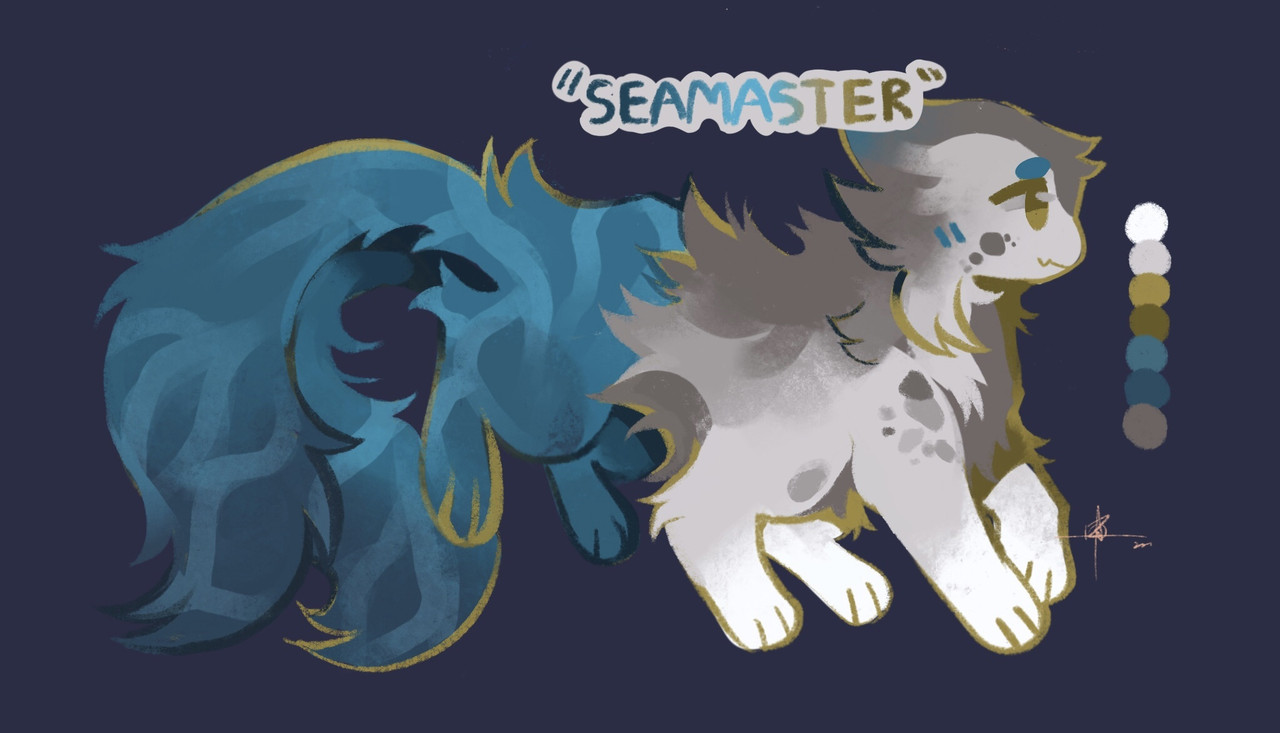
Color palette
Note: Basically, to make a hex code color palette for your character, just create one big card and use <div class="row no-gutters"> to create a row of small cards, then change the background color of each of the cards to the colors of your character.
Don't know what your characater's hex codes are? Use this colorpicking website!
Color palette of Seamaster
Overlaying 2+ elements
Note: I know there are more sophisticated meethods to go about doing this, but way I do it is I create a p-0 card, set the background to an image, then I add in another p-0 card within this card and set the background to something too. If all works properly, the two elements will overlap without any problem!You can definitely do this 3+ cards, but I have not tested it to see if looks wonky or not.
Overlaying Omega seamaster background + my character Seamaster
Recent Images
No images.