Luckyee

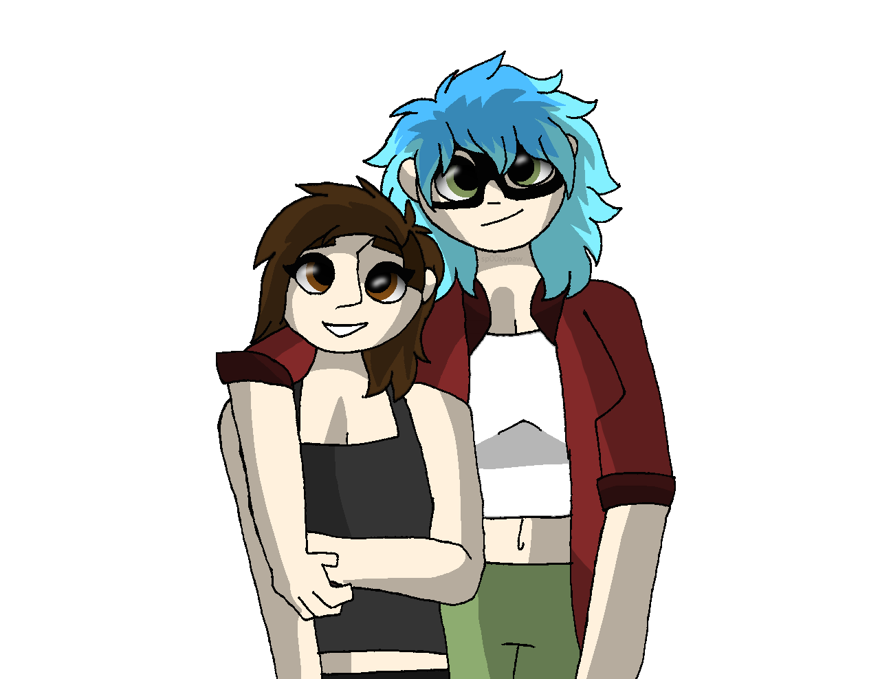
Hm, your art is actually really nice tbh! I think that one thing you might want to change would be your shading methods, tho, and here’s why;

The soft brush tool tends to make the area look muddy, but shading with black and not a color in the mid-range usually doesn’t work too well, unless you’re cel shading!

Instead maybe try out downloading a few blending // painting brushes (which you don’t need to use for painting, and rather shading) and depending on the colors you have, pick blue, green, purple, or pink to shade it! You’ll find that it will be a lot more vibrant~ ^^

Another thing I noticed was that you tend to pillow shade ( shade from all corners, with no visible source of light ), and what i’d do for that is I’d draw out your source of light ( a quick sun or a lamp will do) on a different layer and point it where you want it to go, then draw out guidelines for where it hits the body. Depending on how close or far the light is will be how big  or small the shadows are!

Overall, your art is really nice! All you gotta do is some refining!

sp00kypaw

Checkers

Oh heck thank you!! i've been working on my shading but the program i use (deviantart muro) is quite hard to operate when it comes to shading. Im working on a few that'll focus mainly on shading so hopefully that'll improve ^w^

Luckyee

sp00kypaw

Oof, I know how that must feel with how hard it is on DA. My friend used it for a long time and I saw them struggle via. video :U

I'd suggest getting a free program such as firealpaca, since it works really well and you can make professional art with very little struggle :>

Other free programs that are nice, but not my favorite:

Krita - Doesn't have a good stabilization slider, but it comes with a built in animation timeline feature!

Gimp - I don't really recommend this one, since it's laggy and the brushes aren't too good, but if you know your way around the program, it can be good for very specific things, such as texturing!

And if you're really into art:

Photoshop. If you're a student, sign up for photoshop then send the confirmation email to a personal email. It saves you SO much money. Trust me.

sp00kypaw

Checkers heck i have firealpaca but i've been using deviantart muro for at least four years now, so im pretty used to the simplicity, plus I find it hard to adjust >>:C

I only use it for layered bases like this one https://www.deviantart.com/unstable-stopsign/art/BananaDog-Base-PSD-782749683

Luckyee

sp00kypaw

It might be hard to adjust to, but it's worth it :P

If you aren't sure about linework or anything, use the stabilizer to make sure that you get your lines as smooth as possible. I'd suggest 10-15 for starters!


aaawhyme

Hey there! 

The first thing I noticed right away when seeing your art is the linework. It seems to be the same size all the way through the drawing and makes it look a little flat, even with your lovely colours.

Try having thinner and darker lines, to depict weight of the character/objects.

Thicker darker lines where the folds of clothing/skin are the heaviest. Thinner lines where there's less weight, like the tops of the shoulders and clothing etc. Places where the bones are more prominent under the skin.

I really think adding lineweight to your linework would really add wonders to your drawings, make them pop more! Your colour work is on the right track and I really like the bold colours you choose. Its vibrant and striking. 

Keep up the good work!!

sp00kypaw

aaawhyme oh yes thank you, that's something i havent noticed before!! I'll definitley try to incorporate that ^w^

Keigora

Hmm, I think for one that your art actually is fairly well-rounded. As in there's not any of the things that are decreasing its quality. The linework, anatomy, coloring and shading seem to be on the same quality level, which is a very good thing. But there's always small nitpicks one can do.

So I see there's a difference between how you've colored/shaded some of the art. Some have cellshading (hard shade) while others have more of a soft pillowshading (soft gentle shading) while still having the same lineart type. The cellshaded ones look completely fine, however the soft pillowshading feels like it doesn't belong with the hard pixelly lineart and detailing, they clash HARD. I'd suggest either A: Focus on just cellshading, or B: Keep practicing the softer shading style BUT replace the pixelly lineart with something more smooth.

Speaking of shading, I also noticed that the shading you use is very monotone. As in, the shading is just a darker version of the color you're shading ontop of, which leaves the colors feel very lifeless. But see, there's an easy fix to that actually! If you decide to use another color to shade, say.. if you're shading skin, how about trying something more red'ish or purple'ish to shade it? It makes the colors pop much more and makes it feel a lot more interesting to look at! I myself always use the multiply layer while shading, it helps a lot imo.


Alright but see.. Here's the thing about your art in general.
It's not that it's bad. In fact, it's very cute.
However what you're currently offering in your commissions is the exact same what every other artist like you are offering. The competition for furry art and similar is extremely high, and what you're offering is pretty much what every other single person offers as well. I'd suggest coming up with something more specific to offer. Some do pixel-dolls, some do animated icons, some do small comic strips, and some do sketch pages. Try to expand on what you're willing to offer, and I'm sure more people will be more interested!

sp00kypaw

Keigora thank you as well!! sadly some things cant change in my program but i'll definitely work on doing some pixel commissions!!