I really like how he's a siren, but the one that looks half bird rather than the usual mermaid looking ones. At first his design comes off to me as an angel sort of character, with the large wings and clothing style, it really subverted my expectations. One more thing is that, the wings have a really unique design, looking like a ribbon from the back.
she's literally BOOMING w positive energy like my god she made me smile myself even before I opened her profile- nvm she's mean (I support 200%). AMAZING use of shapes on the outfit!! I like how it's pretty detail-heavy yet every element is perfectly distinguishable. I also love how the colors don't clash w each other despite there being quite a few of them! very very pretty /her last pic has me crying ty/
vvv *teary eyes emoji* oh my gOD. I'm speechless thank you SO MUCH <3 I'm super happy to know his facial features actually convey his character :")
^^ Of course! I am glad I was able to make you *teary eye emoji* :) (I do do this when I am on laptop and don't feel like searching for a copypaste)
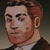
Now don't get me wrong, I love all the super hot anime characters that are super convetionally attractive with some super cool accessories and bright colors- But sometimes it's great to have a change in that. Renat is completly different looking that what I am used to on Toyhouse that I was actually convinced he was gonna be the evil dad of the 'real' traumatized OC.
But he's not, and I really appreicate that. We put too much biases on old men. Sometimes I just wanna see an old guy who is tough and sad who isn't an awful dad. He's got a very realisitc face and I love all the scars. They aren't overly distracting nor are they too not there to be noticable. He looks like a traumatized man, and is one so he pulls that off really well.
@NP Her LORE isn't there yet, so just go stricktly if she looks good or not. This is just my base design idea 0//v//0
Since no one was really claiming after me, I decided to change the OC! You can compliment him, or anyone else in his folder!
WTF HE LOOK KINDA COOL THO!??? Like just from looking from his avatar he gives me such like, Gorillaz vibes. Also the colors work really well, like the red with the purple? It's super pleasing to the eye imo. I also really love the little red lines under his eyes, uhh eyeshadow? It really makes Stop Sign's eyes stand out, which is what you want for a character design because it attracts the eyes to the face. Also the vibe he's off putting!! This like, super "Nobody can stop me! I will never give up!!" Kinda vibe to him y'know? And considering he's a combat fighter, it makes sense.
I'm sorry I tried to put as much as possible, I need to do these more lol
ohhhhh slouched and spiky characters my beloved
i LOVE his vibes and the simplistic gray n black palette mixes rlly nicely :33 i like the stripes and they kinda remind me of old cartoony stripes and i like how its kind of a motif throughout the whole design, the spikey/sharp shape language rlly blends in nice w all the stripes !! im also a sucker 4 animal characters who have a rlly, rlly long mouth and sharp teeth that give off a greasy n untrustworthy vibe. overall, the whole design successfully gives off a mean, rebellious, n dark personality which is awesome considering all i originally looked at was the design!! peak designing fr