thanks so much for making this and for making this free! It's truly such a beautiful code and it was just perfect to use for my character Halcyon :D This was super easy to understand & edit, I really appreciated all the notes & labels in the code that made it really simple to find the elements I wanted to edit.
I know I've commented on / bought your codes before but honestly this one may be my all-time favorite, right above Captain and Flow. <3 One of these days I've got to commission you for a sci-fi profile custom, augh, this is <i>so</i> wonderful.
Using this for my helluva boss Oc's https://toyhou.se/Timewolflp/characters/folder:4997677
Oh, I loooove how blue and bright all of this is! Def will be using for an OC soon, keep up the good work! 💙
I'm new here, and I watched a lot of tutorials to understand Toyhouse, the first thing I found was your codes, I'm fascinated by how beautiful they are and what a magnificent job you've done! I really love this!
!! using this for my mogus characters (cringe is dead, i killed him) its only on Green so far but i plan to use it for all my mogus characters !! its so so neat and i love the layout and all the custom colors awa lovely code, overall
This user is not visible to guests.
i started using this template today and its absolutely lovely! I have a question though- (im new to toyhouse so bare with me)- whenever I upload the code to the code section and then click off to view the template and then go back, it re-aligns some of the code to the left making me unabe to do certain things like change the percentage of the stats bar. Is there anything I'm doing wrong?
Hi there!
You are using WYSIWYG, which you should NOT use because it breaks the code!!
You need to turn it off and forget about it when editing codes. You can save your page and look at the results visually and then go to the code editor again or use TH live editor, but you need to always have the pure code in front of you when editing on TH page, no previews with WYSIWYG.
ed: well you figured it out anyway xd
But I strongly recommend Live editor, esp if you're new!
Hi there! Sorry to bother, but I'm having some trouble. The text thats used in the relationship area wont show up as white on the character I'm using to comment this. Do you know how to fix it?
Hi there!
It's your CSS thing, not the code by itself. This one in particular turns all the text in <p></p> tags to a dark color. Either find it in your CSS and change it or make a new p { color: #ccc !important } to overwrite it.

If you're not sure about something that has CSS you can always use inspect element to see what the problem is.
heya! im currently having an issue where this icon keeps vanishing when i copy the code. any fixes? (love this code btw!) 
Hi! I'm using this code for one of my dragon characters, love the gradients on the progression bars. Thank you very much for sharing!
I have an issue, whenever I edit text, the profile boxes on the relationship thingy gets smaller untill it’s basically not visuals for some reason. Is there some way I could fix this?
Hi!
It's hard to tell anything without the visual examples of what's going on. Can you provide some screens?
On the guess, if you happen to use WYSIWYG then it's the reason why something breaks and you need to turn it off completely and take the clean version of the code to edit in the Code editor only.
If you don't use WYSIWYG then, as I said, I won't be able to help without some extra information provided!
It’s not the actual text I was editing it happens with all the text I just used the closest one
Ah, I see now!
As I thought, the problem is that you are using WYSIWYG (The visual editor) and trying to edit code with it. The code SHOULD NOT be edited with WYSIWYG!!!
You need to turn it OFF for "Profile text" in your account settings, turn Code Editor ON and NEVER try to edit codes with WYSIWYG. I've left a plenty of comments inside the code so it should be comfortable to work with without the visual part! Still you can also try using TH live code editor if you want to see your changes in the code live!
You also should use the clear version of the code as this one is already broken by WYSIWYG
I’ve been waiting for a while to find a character that would be perfect for this code— and inspo struck yesterday!! The way you’ve got it set up so people can edit it easily!! I appreciate that so much. The styling on this is just incredible, thank you so much for sharing it publicly <3
Oh geez, this is just so amazing!
Seriously can’t stop looking at this, actually. I had to open another tab with this code while writing this so I could go back and just admire this bit of craftsmanship! Just the adorable little ID card smack in middle, the clear 3 separate parts.
Again, the song. Love how its probably still the same code you used for the complex code, but in here, the use is completely different, and suggesting that the song shouldn’t be changed. The blue 3 blue lines and one white line is also so cool for some reason, contrast just feeling… right.
The unique design around the characters profile, with the gradient to match. Also adorable! It’s like a little astronaut helmet :)
The lore:
I love the ‘astronaut passport verified’ and how it really gives the vibe of an actual astronaut Id. The soundtrack, as said before, adds to the mood, but with the new context of a semblance of lore, it fits even more, because yes, whether intended or not, you did craft a literal semblance of story to this code and I am loving every bit of it.
I am loving the ID icon, the vibe that this is just some file on an astronaut, with pretty aesthetic to fit. The second buts the bulk of the file, the meat and fun of it. And then you transition to the relationships which in this little code, where everything’s full of whimsical life and aesthetic, this bit can feel like it’s ‘exposition’. But I love how that text on the top links it all together!
Literally. I honestly feel like I now have to create a character to fit the aesthetic so I can use this unique, detailed but compact code. Fantastic work. My only small personal issue I’d ever change, would be in the appearance tab, to find a way to keep the first half completely still when you scroll a bit more violently, but thats only a small little nitpick thats probably not even worth fixing or even mentioning, because of how clever the rest of this is.
again, how the heck do you plan these stuff? Do you have vague notebook scribbles, do you jump right in and your sketch pad is the code itself, do you plan this out in an art program? how much tweaking does it take to create these gorgeous stuff or do you just have the vision from the beginning?
Thank you!!
I'm always so happy when people notice all the things I put into layouts! It's like, you know, when you create an art piece and you put some details here and there, still knowing that everyone will find their own meaning in your artwork because that's how art works (and that's great!), but still some people find the exact meaning you put by yourself and you become so exited that they have a similar way of thinking haha. It's also cool to hear that my layouts serve as an inspiration source (like, the desire to create a character matching it? Sounds dope). Although I don't have the same problem you mentioned about design tab. The left part stands still even when I scroll up and down rapidly! Maybe it's just because I am using Firefox, not Chrome right now, idk.
I actually make drafts almost all the time!! For the past few months I was unable to make them digitally so I sketched them on paper. Here's how the initial draft of this one looked like:

As you can see, some things have changed since I started writing the actual code for this one! I always try to make layout drafts very simple with no decorations and styling yet. All of that (some forms, the overall shape, color palette & decorative elements) I create and apply in the process, when I have the layout base coded. Still I don't really change much and it usually sticks to the initial look without drastical changes. It was just one time with Spore layout when I did code one of the sections and then were like "nah screw it", deleting it and replacing with the whole anoher xddd
Sorry, one last thing I know you’re probably not gonna be able to answer this, but I’m just curious about how much time it takes to code something? Or do you remember general timeframes of how long it took for a specific code? And how do you figure out colors, a vague idea beforehand and then a lot of playing around in the moment?
Due to my current life situation and things happening in my country, I don't really have a lot to do aside from coding and studying so I spend quite a lot of time working on the layouts! I can finish one in about three to five days, working aprox. 3-5 hours a day (in total and not at once, without breaks count) but still it also depends on the level of detalization and how clear I see what I want to do in the end.
For the codes 10 (this one) to 13 (Duotune) I had a pre-made palette on my hands (as they were a part of the challenge) so it was pretty easy to lay colors on the base. For other codes I usually tend to use theme colors with just 1-2 custom accents so I don't need to construct a palette. For fandom layouts (as I do all the fandom ones full custom-colored) I go with the initial fandom theme (for the Food Soul layout I literally matched the canon in-game profile and for the Captain I partially took inspiration from the Spore Wiki).
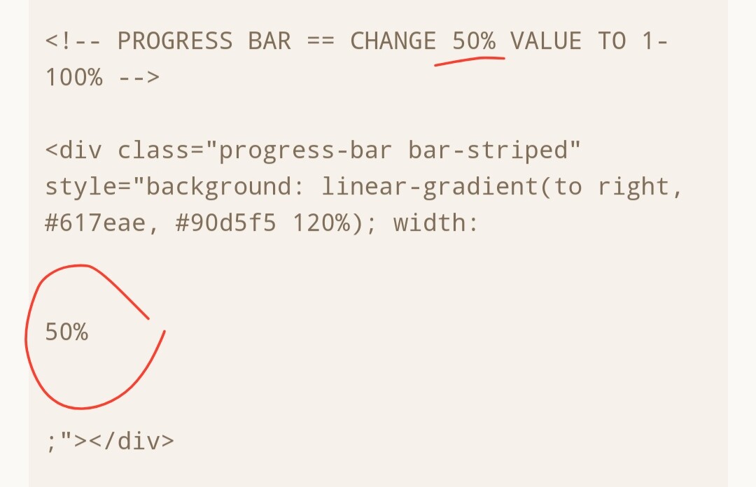
I wanna ask how to properly change the progress bars percentage since I don't really understand where to look to change it!
BRUH I CANNOT EXPLAIN TO YOU HOW PLEASING IT WAS THAT YOU ACTUALLY GOT THE QUOTE BY NEIL ARMSTRONG RIGHT-

Hi!
For that you need to modify your relationship block so it'll look like that:
<!--
 ====================================

 RELATIONSHIP BLOCK

 ====================================
 -->
 <div class="col-12 mt-3" style="border-radius: 3em; background: #111115; font-family: Courier New, monospace; overflow: hidden;">
 <div style="height: 300px; overflow: auto;">

 BLOCK CONTENT

 </div>
 </div>
And then you need to insert everything that was previously in the initial div (it'll be the <p class="text-uppercase mt-4 mt-lg-2 mb-2 pl-2 pl-lg-5 m-3 m-lg-0" style="color: #fff; font-size: 17px;"></p> and <div class="row no-gutters p-2"></div>) instead of the BLOCK CONTENT
10. || Out There's Comments