Profile
Literary CSS
Premium CSS with a bonus HTML folder code included. Please note this only works for premium accounts. It is Mobile Friendly and should be properly responsive accross most devices.
Code uses Custom Colors and Custom Fonts that you can adjust with the provided CSS Sheet. The page width,portrait shape and other display elements are all adjustable as well. You can see more customization examples below.
Note that sometimes CSS can be tricky! If you think you are encountering an issue, please feel free to contact me and I will try to fix it ASAP!
NOTE: If you had purchased the earlier version of this code prior to May 2025, you can access the download for the new version via your email. If you have trouble finding the download link, just contact me via DM with a screenshot of your receipt and I can send you the new files directly. The new 2025 version has a handful of bug fixes as well as more customization options, so I strongly recommend updating to the new version!
Information
Literary CSS is an elegant, Dark Academia themed CSS with sidebar, background image, and a contained content area with a paper texture background. Comes with an All-in-One Premium CSS Sheet that can be used on User Profiles, Folder Pages, Character Profiles, & Worlds. Colors & Fonts are almost all fully customizable, so you can swap the preview colors any to color scheme of your choice.
It comes with a simple Folder Header HTML code to match the style of the CSS. This is optional. Other HTML will likely work fine, though the CSS will customize certain elements the same way it customizes the base layout, such as default colors and fonts. You may need to adjust custom HTML to display as you like in that case.
Note that this has been updated from my 2022 version of the CSS! Certain issues from the old version of the code have now been fixed, and more customization options have been added. It has been minimally restyled to be a little cleaner, but the general design has remained the same. If you previously purchased this code prior to May 2025, you should be able to download the files from this new version via Email. If you can't access the files, just DM me and I will get them to you!
CUSTOMIZATION
This CSS can be mostly customized to your preference. You can change colors, images, and custom fonts.
It has a handful of options to toggle on and off certain layout elements if you prefer the layout to be more or less minimal. There is information in the CSS Sheet provided on how to do this.
If there are elements you would like further customized, you can contact me for a custom quote, but otherwise I cannot make additional changes for you.
The customization sheet below will be included as an HTML file so you can check your color changes against it.
Font Styles & Headers
There is a body font & and a header font you can choose separately. Make sure you import the Google Font correctly if you choose to change the fonts that come pre-selected with the layout.
Header One
Header Two
Header Two Alt.
Header Three
The default headers have been styled to be slightly larger than the default, and h2 has an alternate style with the primary color.
Default Card
Lorem ipsum dolor sit amet, consectetur adipiscing elit. In imperdiet rhoncus egestas. Morbi malesuada gravida dictum. Duis pretium arcu vel pretium venenatis. Aliquam erat volutpat. Phasellus sit amet nibh sapien.
Faded Card
Lorem ipsum dolor sit amet, consectetur adipiscing elit. In imperdiet rhoncus egestas. Morbi malesuada gravida dictum. Duis pretium arcu vel pretium venenatis. Aliquam erat volutpat. Phasellus sit amet nibh sapien.
Info Alert
Lorem ipsum dolor sit, consectetur adipiscing elit.
Success Alert
Lorem ipsum dolor sit, consectetur adipiscing elit.
Warning Alert
Lorem ipsum dolor sit, consectetur adipiscing elit.
Danger Alert
Lorem ipsum dolor sit, consectetur adipiscing elit.
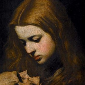
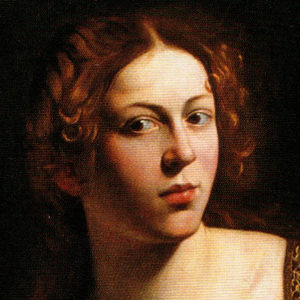
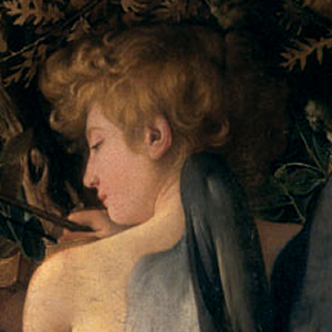
Character Selection Preview
This is a preview of how the character gallery will display on the folder page. The portraits are larger than the default and there are five to a row. Default is circular portraits, but you can change the shape / border radius yourself with the CSS sheet provided.


Character Folder Preview

Character Tags Preview
This is a preview of how the character tags will display on the folder page. You can toggle the tags off in the CSS sheet if you prefer.
