Profile
$4 • Night Mode CSS
- This is a Premium CSS Code styled with more subtle colors than the default Night Theme.
- The download includes a Premium CSS Sheet only. The CSS is All-in-One and can be used on User Profiles, Folders, Character Profiles and Worlds. It's mobile friendly, and you can customize the colors.
- Note: Make sure you understand how to edit CSS and HTML on Toyhouse before purchasing!
- Codes are available for download via Kofi which accepts both Paypal and card payments. If you have trouble downloading, DM me.
Download & Links
Information
Night Mode CSS is a simple restyle that is meant to subtly change the default Night Theme colors and restyle base the layout. You can, of course, input custom colors if you wish. Comes with an All-in-One Premium CSS Sheet that can be used on User Profiles, Folder Pages, Character Profiles & Worlds. The single sheet can be used on all page types. Colors & Fonts are almost all fully customizable, so you can swap the blue and dark grey to any color scheme of your choice.
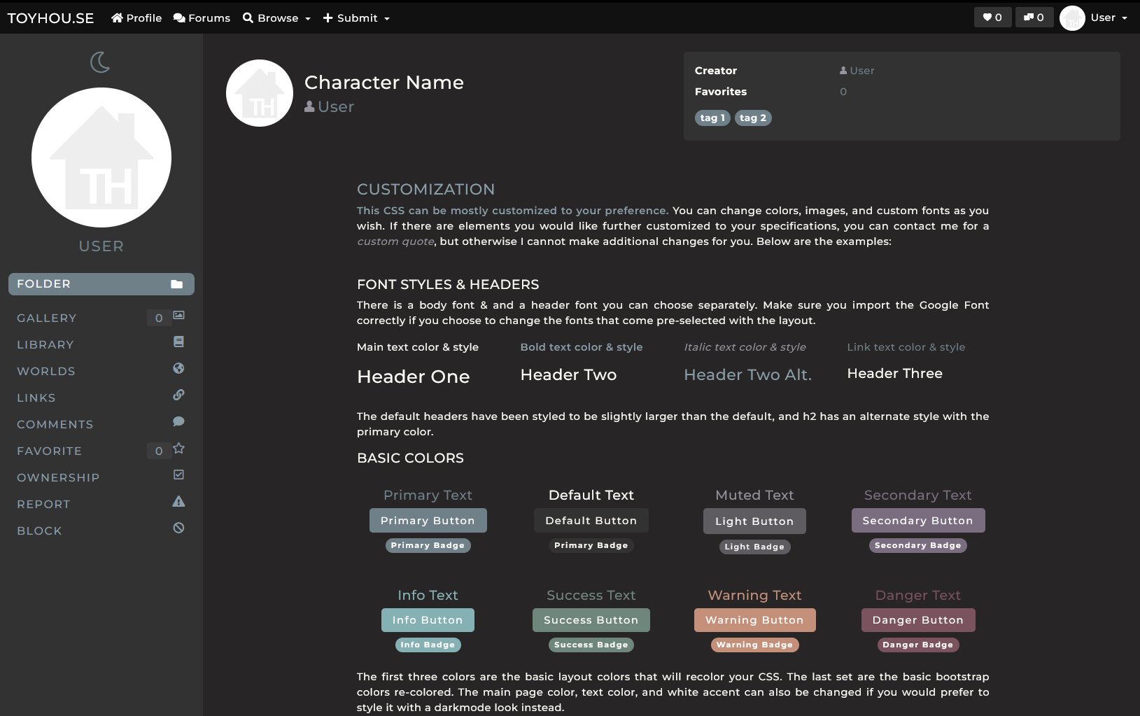
The customization sheet below will be included as an HTML file so you can check your color changes against it.
CUSTOMIZATION
This CSS can be mostly customized to your preference. You can change colors, images, and custom fonts as you wish. If there are elements you would like further customized to your specifications, you can contact me for a custom quote, but otherwise I cannot make additional changes for you. Below are the examples:
FONT STYLES & HEADERS
There is a body font & and a header font you can choose separately. Make sure you import the Google Font correctly if you choose to change the fonts that come pre-selected with the layout.
Header One
Header Two
Header Two Alt.
Header Three
The default headers have been styled to be slightly larger than the default, and h2 has an alternate style with the primary color.
BASIC COLORS
Primary Text
Default Text
Muted Text
Secondary Text
Info Text
Success Text
Warning Text
Danger Text
The first three colors are the basic layout colors that will recolor your CSS. The last set are the basic bootstrap colors re-colored. The main page color, text color, and white accent can also be changed if you would prefer to style it with a darkmode look instead.
CHARACTER GALLERY
This is a preview of how the character gallery will display on the folder page. The portraits are larger than the default and there are six to a row.