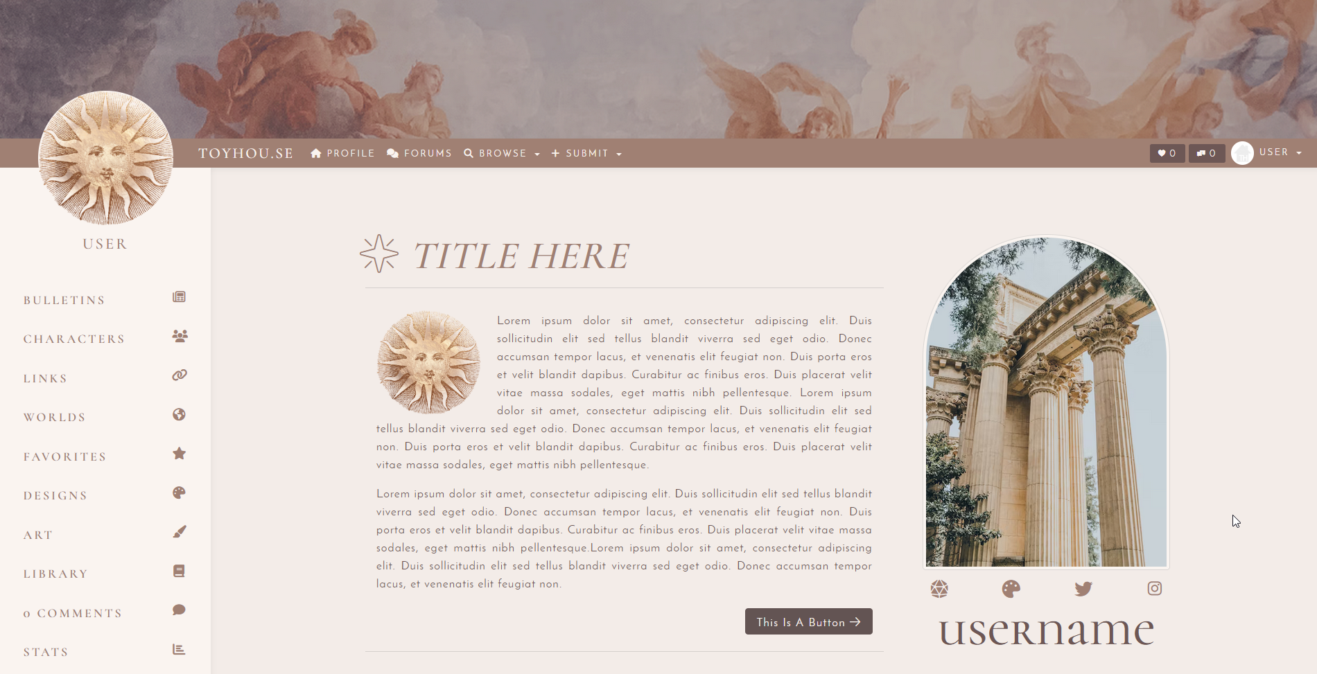
Profile
Mythic CSS Bundle
Premium CSS Bundle with HTML codes included. Please note this only works for premium accounts. It is Mobile Friendly and should be properly responsive accross most devices.
Code uses Custom Colors and Custom Fonts that you can adjust to your preference in the provided CSS Sheet. The page width, sidebar, portrait shape and header size are all adjustable as well. You can see more customization examples below.
Information
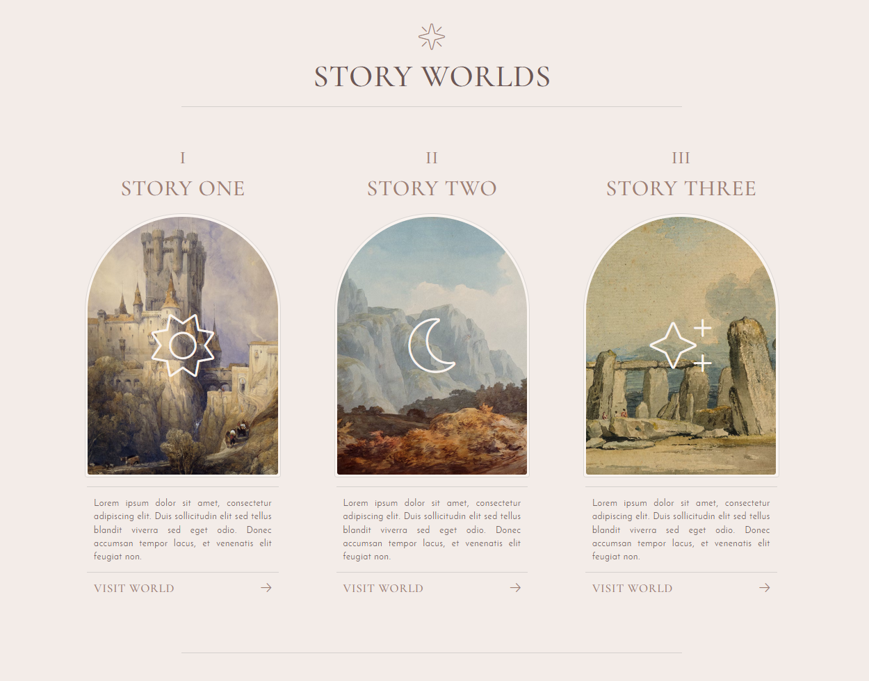
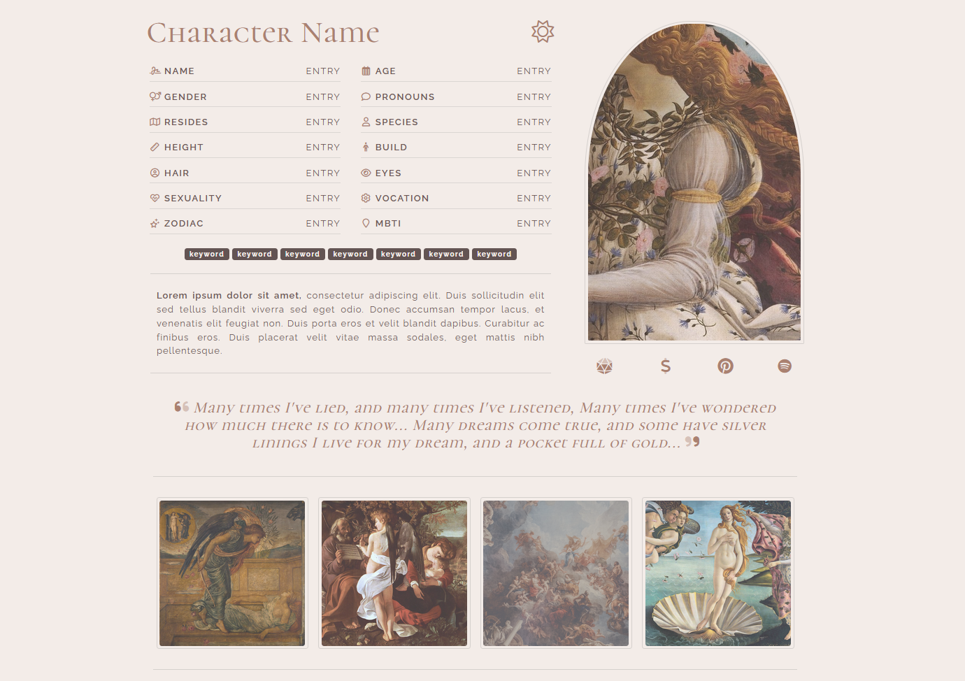
Mythic CSS is a spacious full width CSS layout with a header image and an elegant classical theme. You can, of course, input custom colors if you wish. Comes with an All-in-One Premium CSS Sheet that can be used on User Profiles, Folder Pages, Character Profiles & Worlds. The single sheet can be used on all page types. Colors & Fonts are almost all fully customizable, so you can swap the preview colors any color scheme of your choice.
It comes with a simple User Profile HTML code and a simple Folder Page HTML code. These are optional. Other HTML will likely work fine, though the CSS will customize certain elements the same way it customizes the base layout, such as default colors and fonts.
The customization sheet below will be included as an HTML file so you can check your color changes against it.
INCLUDED HTML
CUSTOMIZATION
This CSS can be mostly customized to your preference. You can change colors, images, and custom fonts as you wish. If there are elements you would like further customized to your specifications, you can contact me for a custom quote, but otherwise I cannot make additional changes for you. Below are the examples.
Font Styles & Headers
There is a body font & and a header font you can choose separately. Make sure you import the Google Font correctly if you choose to change the fonts that come pre-selected with the layout.
Header One
Header Two
Header Two Alt.
Header Three
The default headers have been styled to be slightly larger than the default, and h2 has an alternate style with the primary color.
Card Header
Default Card
Lorem ipsum dolor sit amet, consectetur adipiscing elit. In imperdiet rhoncus egestas. Morbi malesuada gravida dictum. Duis pretium arcu vel pretium venenatis. Aliquam erat volutpat. Phasellus sit amet nibh sapien.
Card Header
Faded Card
Lorem ipsum dolor sit amet, consectetur adipiscing elit. In imperdiet rhoncus egestas. Morbi malesuada gravida dictum. Duis pretium arcu vel pretium venenatis. Aliquam erat volutpat. Phasellus sit amet nibh sapien.
Card Header
Secondary Card
Lorem ipsum dolor sit amet, consectetur adipiscing elit. In imperdiet rhoncus egestas. Morbi malesuada gravida dictum. Duis pretium arcu vel pretium venenatis. Aliquam erat volutpat. Phasellus sit amet nibh sapien.
Button, Badge, & Progress Colors
Light Badge Default Badge Primary Badge Secondary Badge Info Badge Success Badge Warning Badge Danger Badge
Light Btn Default Btn Primary Btn Secondary Btn Info Btn Success Btn Warning Btn Danger Btn Default Btn Primary Btn Secondary Btn Info Btn Success Btn Warning Btn Danger BtnInfo Alert
Lorem ipsum dolor sit amet, consectetur adipiscing elit. In imperdiet rhoncus egestas. Morbi malesuada gravida dictum. Duis pretium arcu vel pretium venenatis. Aliquam erat volutpat. Phasellus sit amet nibh sapien.
Success Alert
Lorem ipsum dolor sit amet, consectetur adipiscing elit. In imperdiet rhoncus egestas. Morbi malesuada gravida dictum. Duis pretium arcu vel pretium venenatis. Aliquam erat volutpat. Phasellus sit amet nibh sapien.
Danger Alert
Lorem ipsum dolor sit amet, consectetur adipiscing elit. In imperdiet rhoncus egestas. Morbi malesuada gravida dictum. Duis pretium arcu vel pretium venenatis. Aliquam erat volutpat. Phasellus sit amet nibh sapien.
Character Gallery Preview
This is a preview of how the character gallery will display on the folder page. The portraits are larger than the default and there are five to a row. Default is circular portraits, but you can change the shape / border radius yourself with the CSS sheet provided.