Profile
Vanitas CSS Bundle
Premium CSS Bundle with HTML codes included. Please note this only works for premium accounts. It is Mobile Friendly and should be properly responsive accross most devices.
Code uses Custom Colors and Custom Fonts that you can adjust to your preference in the provided CSS Sheet. The page width, portrait shape and header size are all adjustable as well. You can see more customization examples below.
Note that sometimes CSS can be tricky! If you think you are encountering an issue with how something is working, please feel free to contact me and I will try to fix it ASAP!
Information
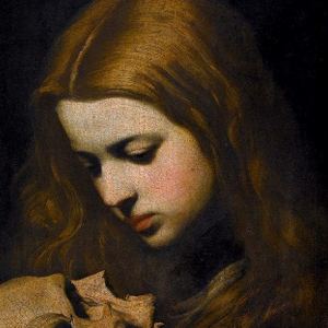
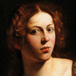
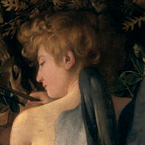
Vanitas CSS is a minimal, spacious, full width CSS layout with a top bar and featured background image. It's styled based around baroque era art as a theme. You can, of course, input custom colors if you wish. Comes with an All-in-One Premium CSS Sheet that can be used on User Profiles, Folder Pages, Character Profiles, & Worlds. Colors & Fonts are almost all fully customizable, so you can swap the preview colors any color scheme of your choice.
It has a handful of options to toggle on and off certain layout elements if you prefer the layout to be more or less minimal. There is information in the CSS Sheet provided on how to do this.
It comes with a simple User Profile HTML code and a simple Folder Page HTML code as well as two Character Profile HTML codes. These are optional. Other HTML will likely work fine, though the CSS will customize certain elements the same way it customizes the base layout, such as default colors and fonts. You may need to adjust custom HTML to display as you like in that case.
The customization sheet below will be included as an HTML file so you can check your color changes against it.
INCLUDED HTML
CUSTOMIZATION
This CSS can be mostly customized to your preference. You can change colors, images, and custom fonts as you wish. If there are elements you would like further customized to your specifications, you can contact me for a custom quote, but otherwise I cannot make additional changes for you. Below are the examples.
Font Styles & Headers
There is a body font & and a header font you can choose separately. Make sure you import the Google Font correctly if you choose to change the fonts that come pre-selected with the layout.
Header One
Header Two
Header Two Alt.
Header Three
The default headers have been styled to be slightly larger than the default, and h2 has an alternate style with the primary color.
Default Card
Lorem ipsum dolor sit amet, consectetur adipiscing elit. In imperdiet rhoncus egestas. Morbi malesuada gravida dictum. Duis pretium arcu vel pretium venenatis. Aliquam erat volutpat. Phasellus sit amet nibh sapien.
Faded Card
Lorem ipsum dolor sit amet, consectetur adipiscing elit. In imperdiet rhoncus egestas. Morbi malesuada gravida dictum. Duis pretium arcu vel pretium venenatis. Aliquam erat volutpat. Phasellus sit amet nibh sapien.
Secondary Card
Lorem ipsum dolor sit amet, consectetur adipiscing elit. In imperdiet rhoncus egestas. Morbi malesuada gravida dictum. Duis pretium arcu vel pretium venenatis. Aliquam erat volutpat. Phasellus sit amet nibh sapien.
Button, Badge, & Progress Colors
Light Badge Default Badge Primary Badge Secondary Badge Info Badge Success Badge Warning Badge Danger Badge
Light Btn Default Btn Primary Btn Secondary Btn Info Btn Success Btn Warning Btn Danger Btn Default Btn Primary Btn Secondary Btn Info Btn Success Btn Warning Btn Danger BtnInfo Alert
Lorem ipsum dolor sit amet, consectetur adipiscing elit. In imperdiet rhoncus egestas. Morbi malesuada gravida dictum. Duis pretium arcu vel pretium venenatis.
Success Alert
Lorem ipsum dolor sit amet, consectetur adipiscing elit. In imperdiet rhoncus egestas. Morbi malesuada gravida dictum. Duis pretium arcu vel pretium venenatis.
Warning Alert
Lorem ipsum dolor sit amet, consectetur adipiscing elit. In imperdiet rhoncus egestas. Morbi malesuada gravida dictum. Duis pretium arcu vel pretium venenatis.
Danger Alert
Lorem ipsum dolor sit amet, consectetur adipiscing elit. In imperdiet rhoncus egestas. Morbi malesuada gravida dictum. Duis pretium arcu vel pretium venenatis.
Character Folders Preview
This is a preview of how the character folders will display on the folder page. The first row are how the folders will appear without any folder image added. The second row is how folders will appear with images added. The images uploaded will scale to fit the dimensions seen below.

Character Selection Preview
This is a preview of how the character gallery will display on the folder page. The portraits are larger than the default and there are five to a row. Default is circular portraits, but you can change the shape / border radius yourself with the CSS sheet provided.


Character Tags Preview
This is a preview of how the character tags will display on the folder page. You can toggle the tags off in the CSS sheet if you prefer.
Recent Images
No images.